Courtmatics
- Company
- Courtmatics
- Year
- 2016 - Ongoing
- Responsibilities
- UX & Visual Design, SW Product Management, User Research, QA
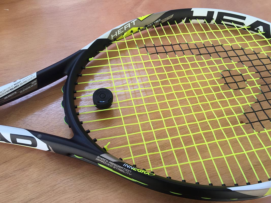
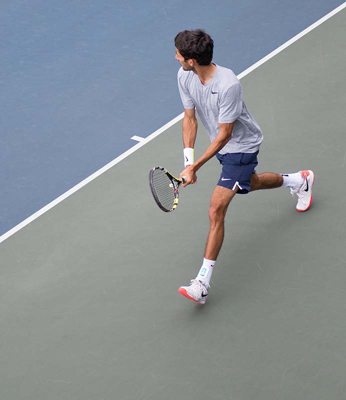
Courtmatics Smart Dampener is an IOT device that attaches to a player’s tennis racquet and gathers data while they practice or play competitive matches. It’s more than a “Fitbit for Tennis” — it acts as a personal coach and provides tips to improve your game. We are working with professional tennis coaches and players of all levels to develop the product and refine the user experience.
This is an ongoing side-project. The product will launch around November 2016.
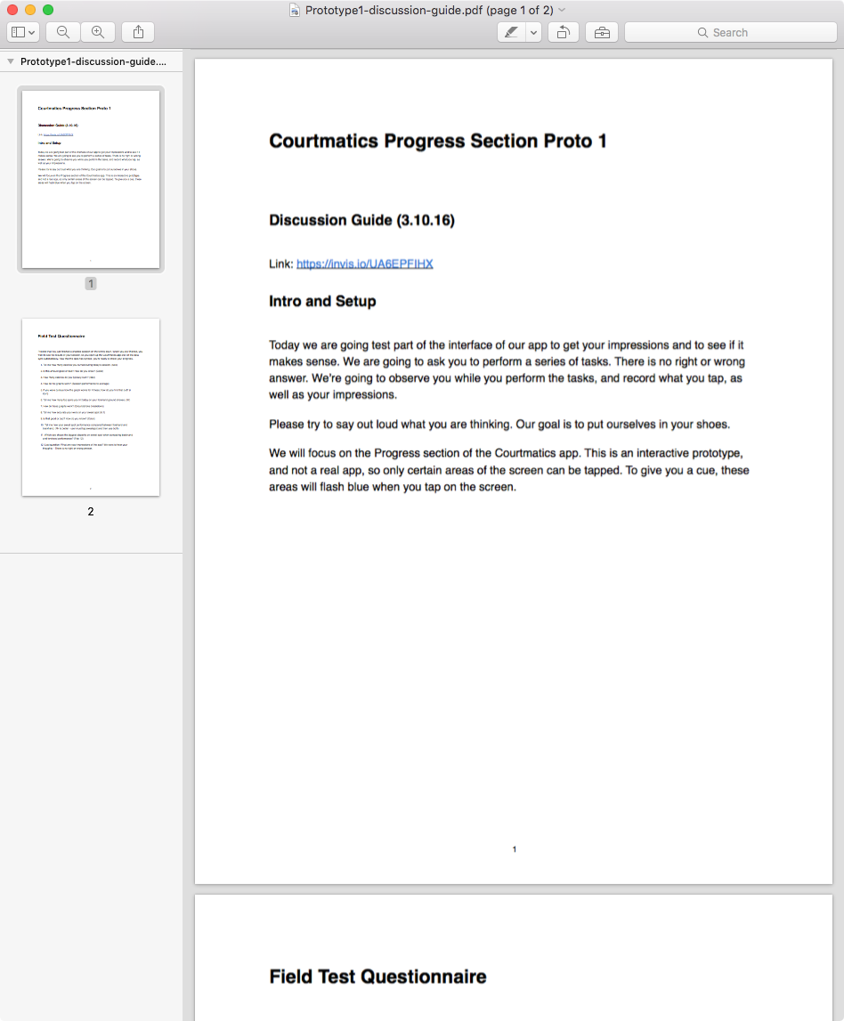
Personalized Coaching
The Courtmatics Smart Dampener gathers data while you play. We combined this data with insights from professional coaches to provide meaningful stats, achievable goals and uncover skill gaps that the player can improve. Video shot and edited by Johan Samuelsson.
Size Matters
Much of the “table stakes” user experience is wrapped up in the hardware interactions. We found that professional players were very sensitive to subtle changes in weight on their racquet. If the device weighed too much, players wouldn’t use it. So a lot of effort went into miniaturizing the componentry, and making it “feel” like a normal dampener.
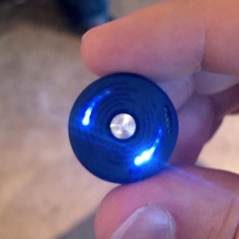
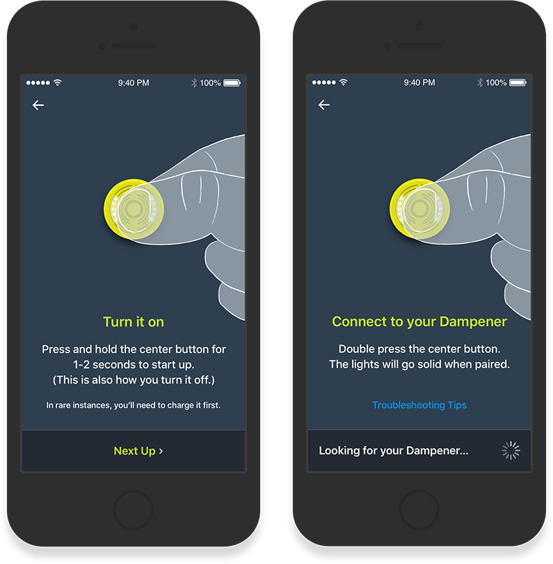
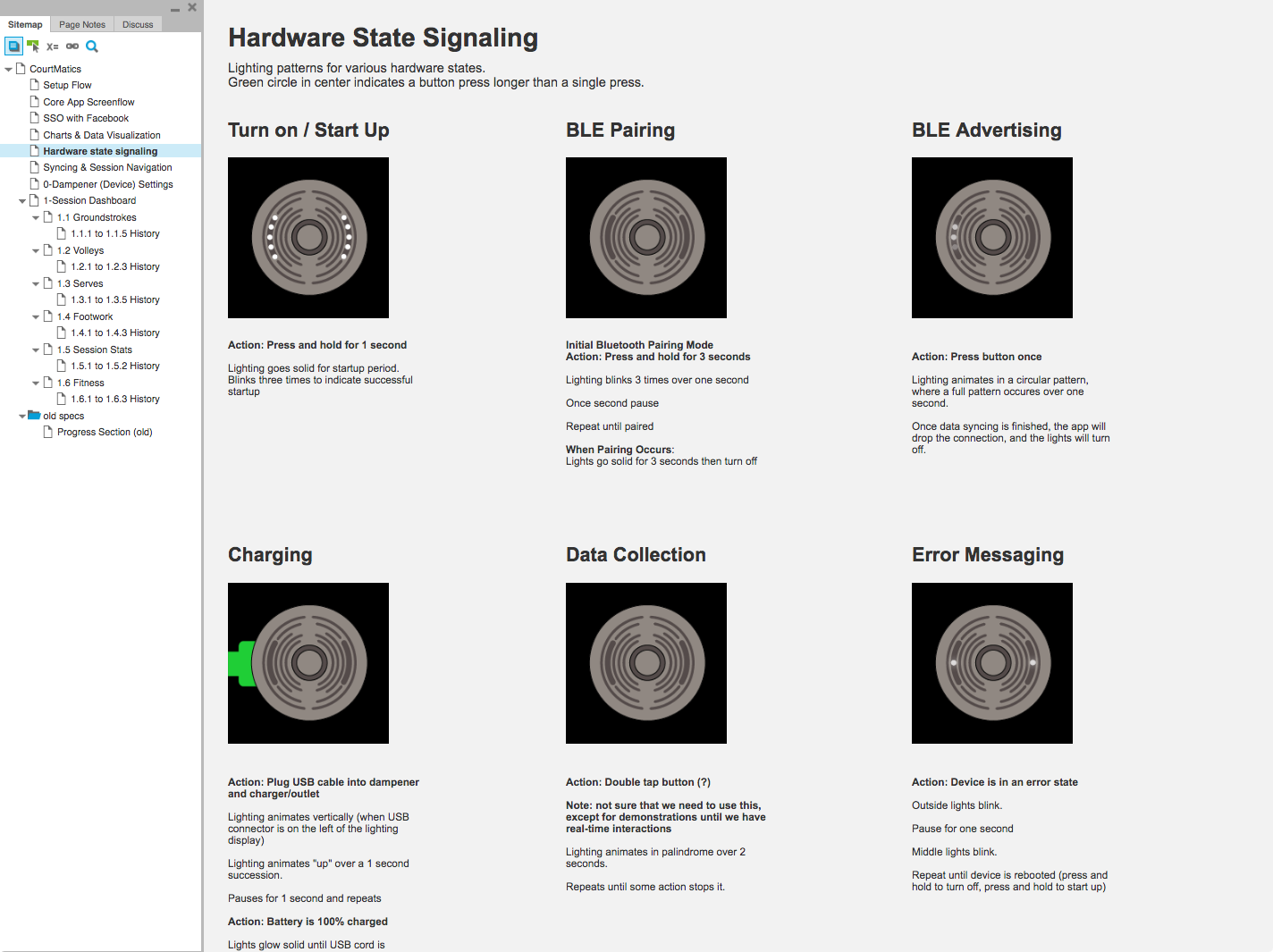
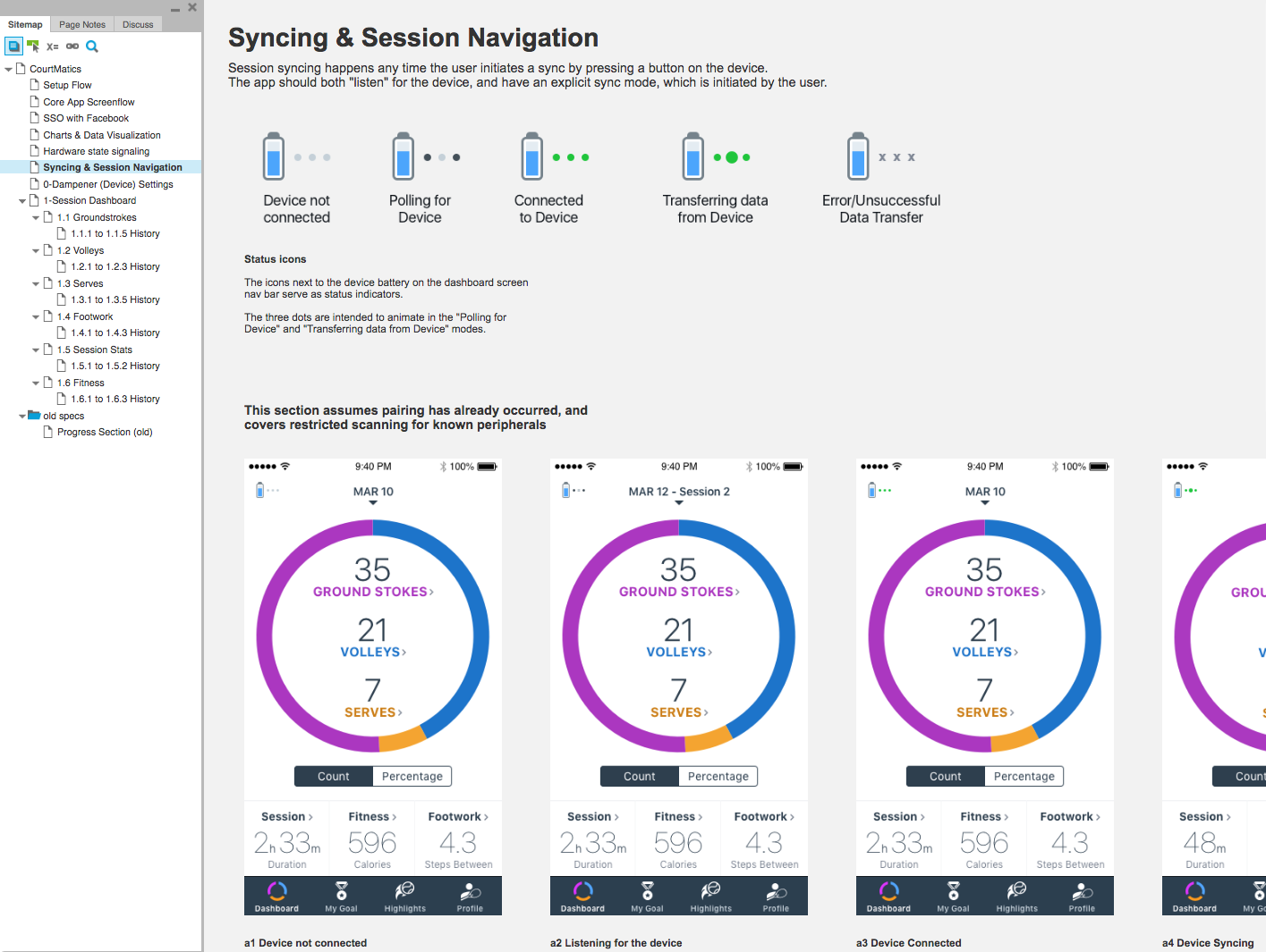
Market research showed us that competitors’ devices were often difficult to connect to, or didn’t provide good feedback about device status. We focused on this challenge early in the development process. The lighting pattern on the device provides clear feedback to the player about the status of the device.
Research and Product Definition
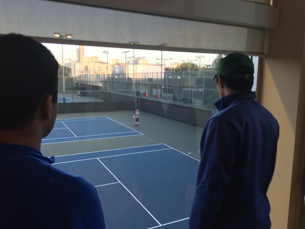
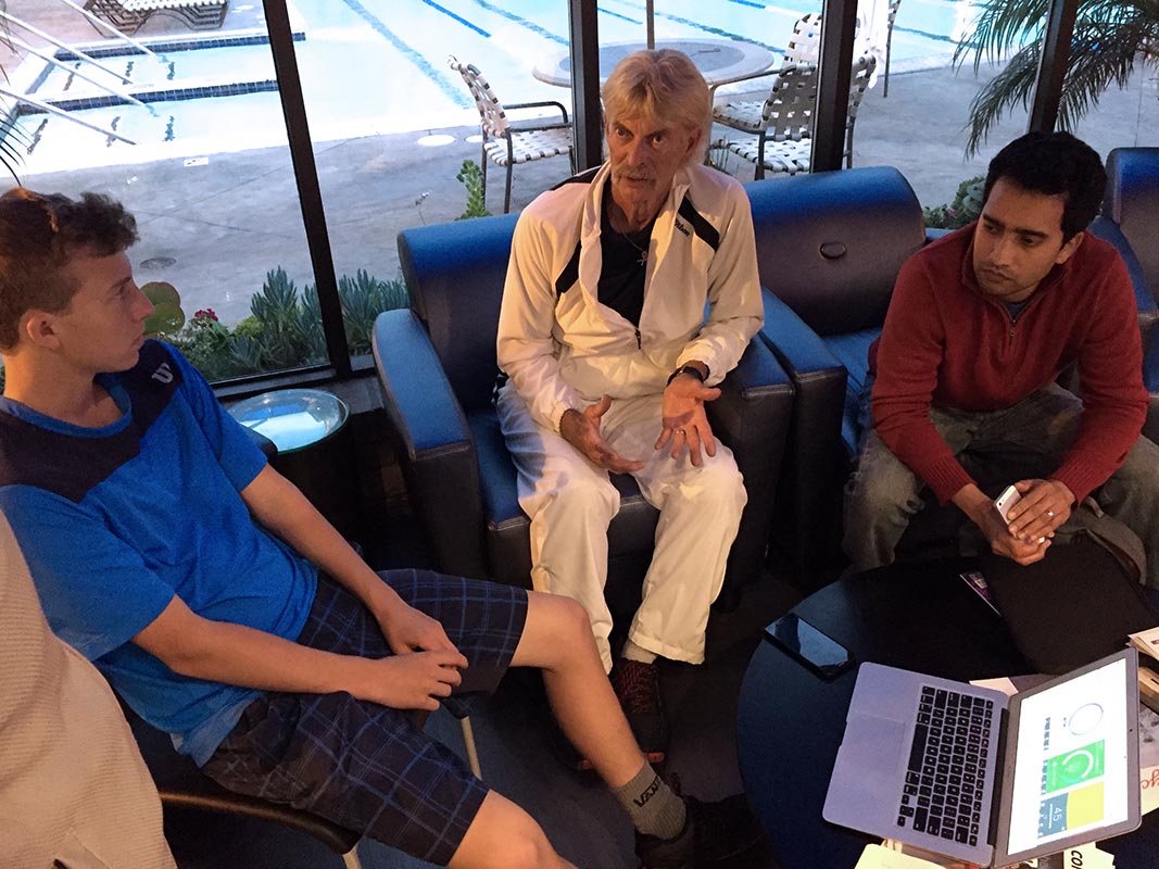
Customer development and iterative UX research have been the cornerstone of our process since early in product development. We have spent several hours on and off the court working with tennis associations, professional tennis coaches and players of all levels to refine the user experience. Our goal is to create a product that does more than just provide “speeds and feeds” of a player’s tennis session.
Although confidential at this point, the outcome of this research uncovered go-to-market opportunities that competitors had completely missed. We used these insights to refine our product thinking and prioritize the features that would provide our users with a meaningful repeat experience.
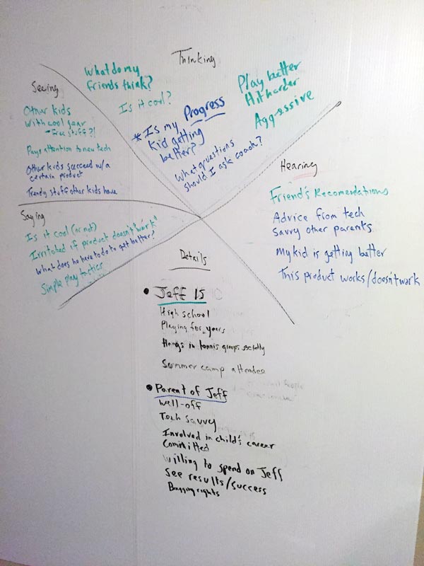
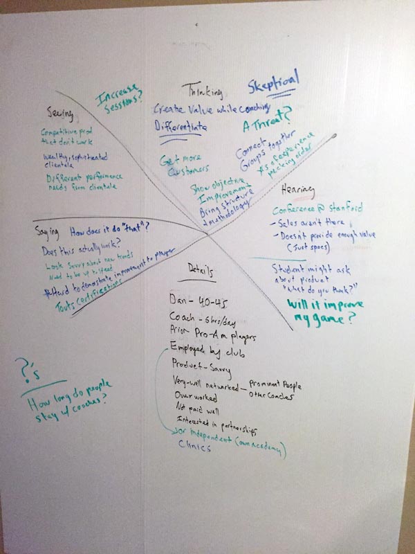
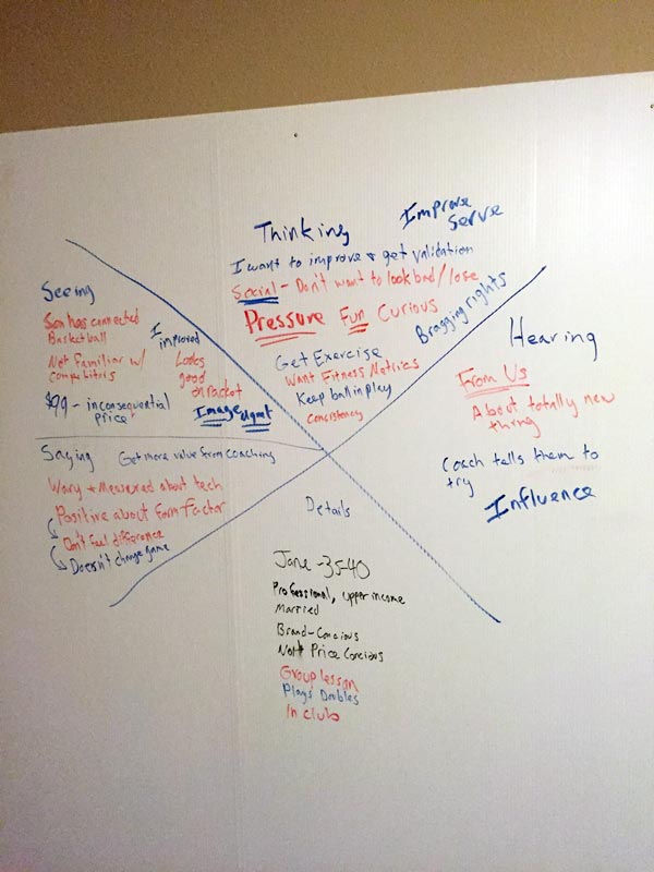
I introduced the team to several tools and tactics that helped us understand our customers and uncover opportunities:
- Customer Interviews
- Empathy Diagrams
- Design Sprints
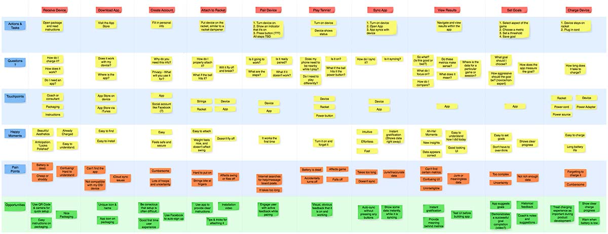
- Journey Map
- UI Prototyping
- Iterative User Testing
A Few Key Insights
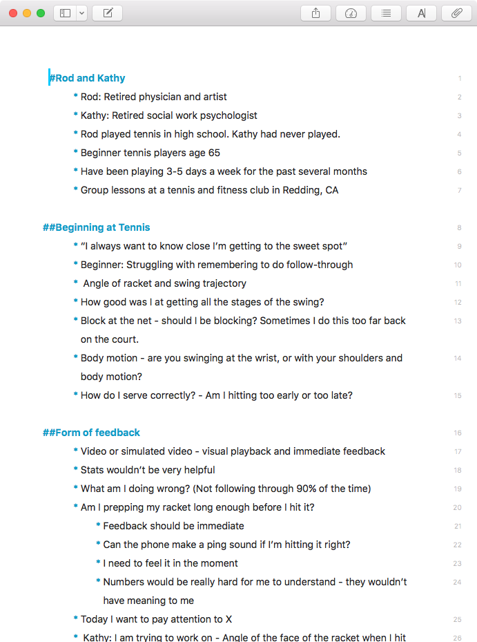
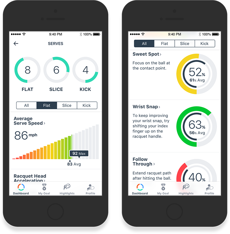
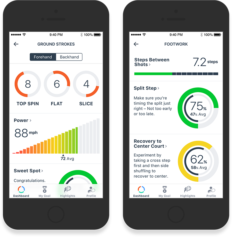
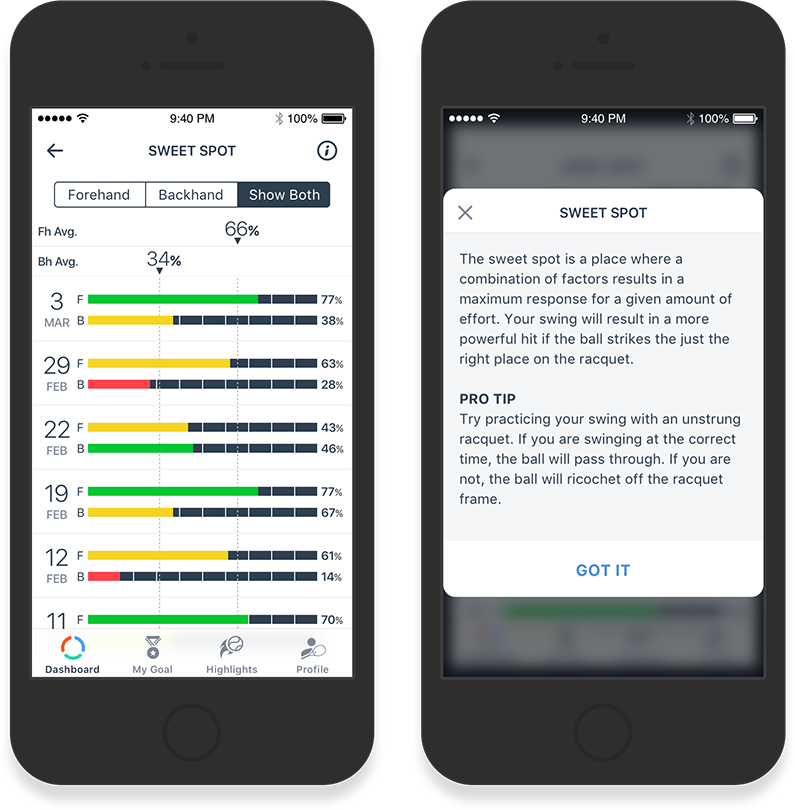
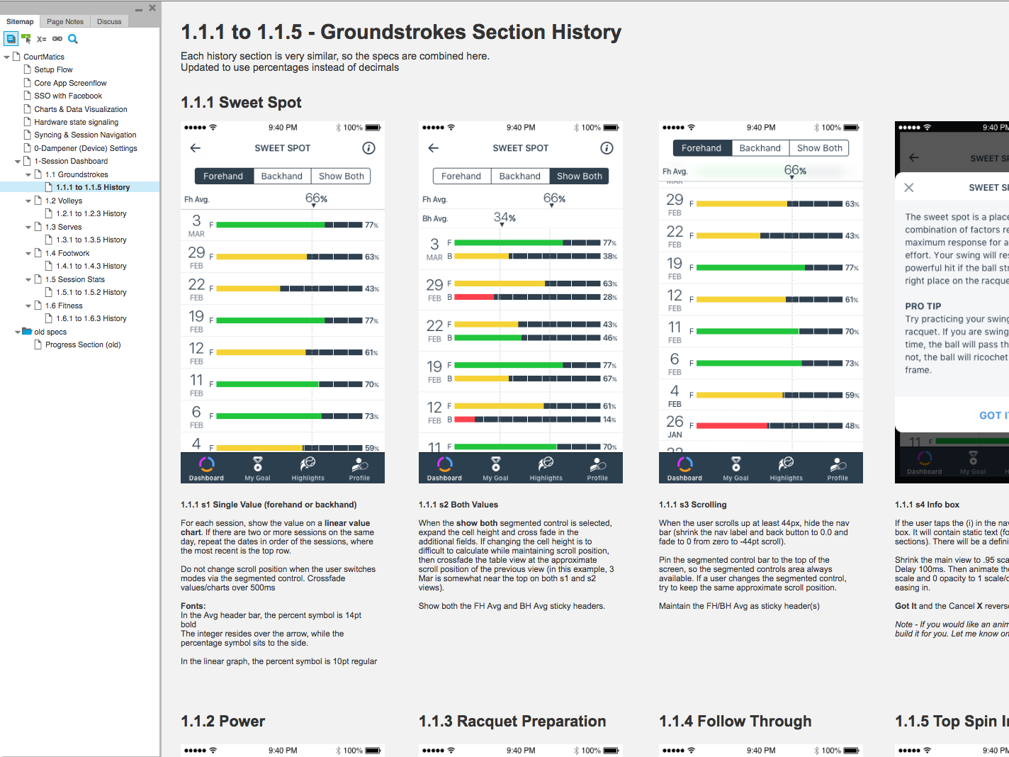
One of the first things we learned is that the raw data visualization is not enough for the players (particularly beginners) to understand how to improve their game. Instead, we worked with pro coaches to develop content that we could associate with these stats in order to provide meaning.
Players want “at a glance” feedback that they could review in between play and during water breaks. This meant that the stats needed to be presented in an ultra-simple, bright, high-contrast UI that’s easy to view in sunlight, with sweat in your eyes and while wearing polarized sunglasses. The first UI I designed didn’t perform well in this regard, but testing early and often allowed me to switch gears.
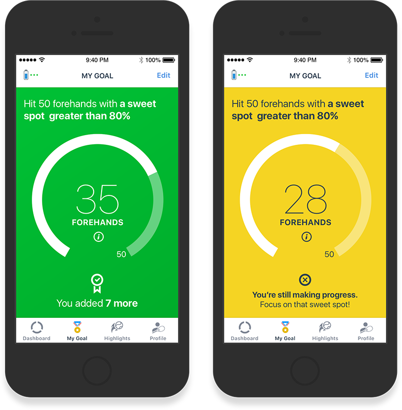
Goal setting was important to both players and coaches, but we found that players could only successfully focus on one goal at a time. I revised the goal setting portion of the interface to be very simple and provide quick feedback. Additionally, coaches only have 5 minutes at the end of a session to set goals with a player, so goal setting needs to be quick and simple.
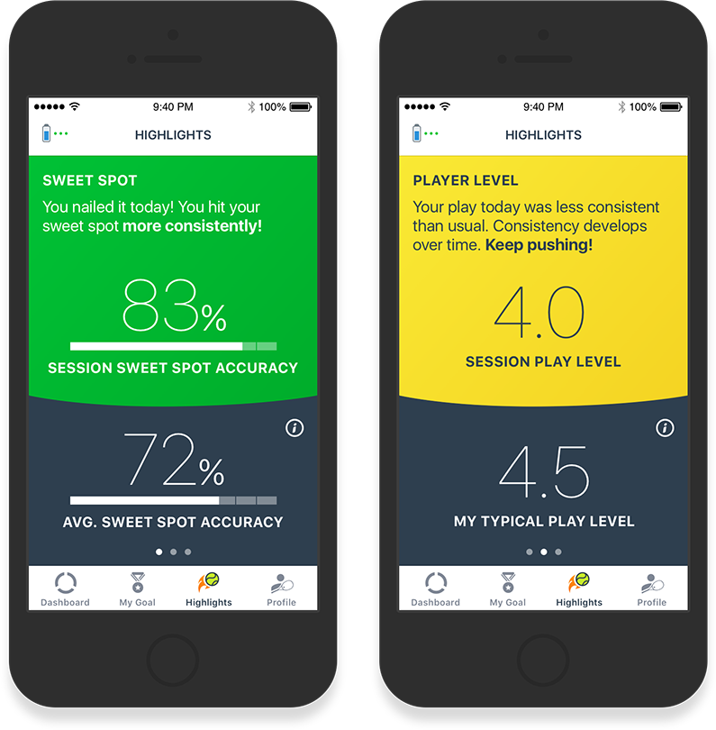
Since tennis is multi-faceted, many players aren’t aware of all of their strengths and areas in need of improvement. So I suggested a new section, called Highlights, where we would analyze the data and highlight aspects of their game where they were performing well, and where they were performing below their average. We have more plans for this section that will make the app an even more powerful tool.
Watch, Learn, Design… Repeat.
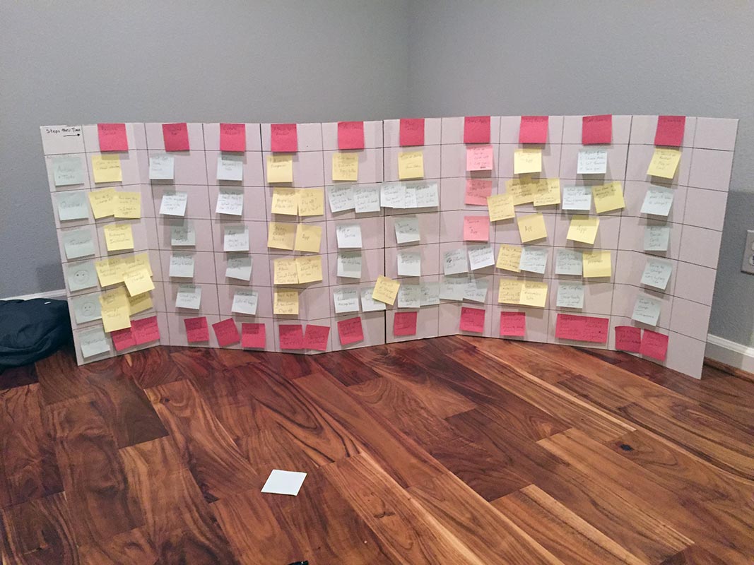
We conducted research by watching and interviewing players of all levels. We learned from professional coaches about the nuances of focused goal-setting and delivering actionable feedback to players.
Empathy maps and user journeys allowed us to consolidate and uncover opportunities based on the feedback we received. We refined our designs by testing UI prototypes with players and coaches— sketching their ideas and feedback to make sure we got it right.
Design Approach
Design/Development is still ongoing.
The visual design draws colors and style inspiration from looks that tennis players are already familiar with.
Contrast and clarity were the two most important considerations in choosing colors, font choices and chart styles. Players are primarily using the app on the court, for a few minutes between sessions — often in direct sunlight. The UI needs to communicate information quickly, and without ambiguity.
As with past projects, I provide prototypes and motion mockups where appropriate. With certain features, such as the syncing animation, I’ll animate them with QuartzCode and check in Objective C UIViews to the Xcode project.
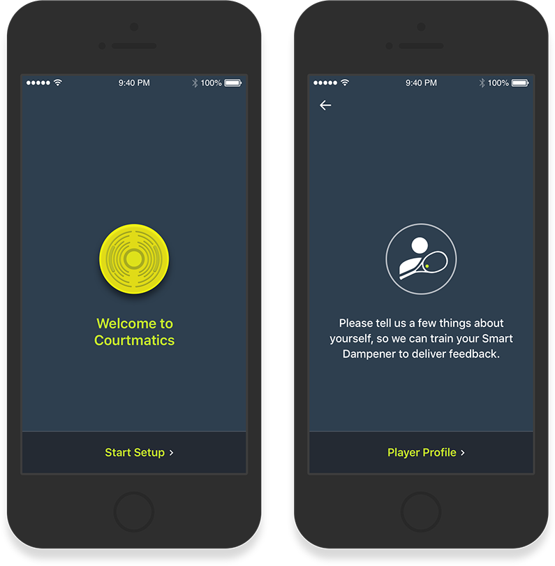
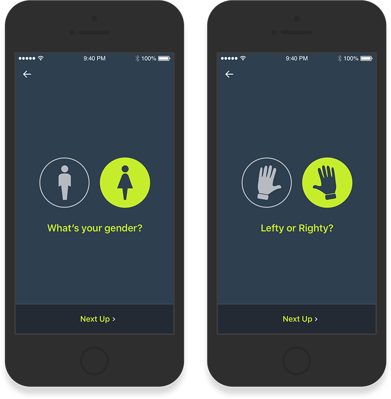
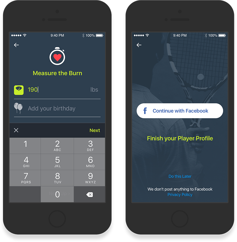
Easy Setup
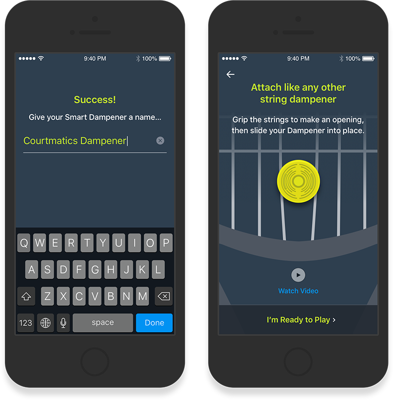
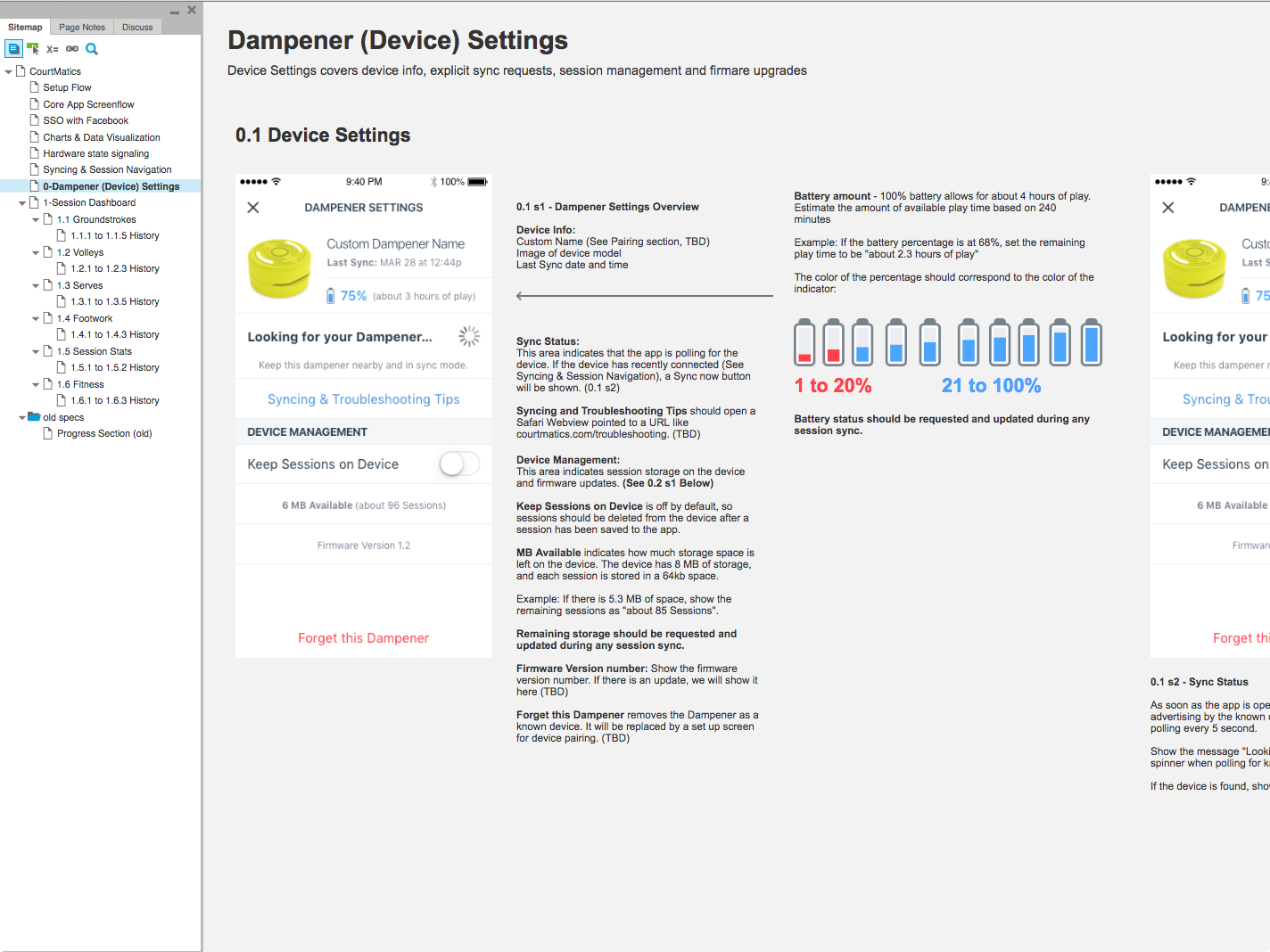
We needed to know a lot of up-front information about the player in order to configure the device. I focused the user on first providing all required data. In case setup fatigue kicks in, I provided opportunities to skip optional information that we could request later.
We wanted to get the player back on the court as quickly and effortlessly as possible. A lot of work went into optimizing the hardware/firmware/app setup interactions in order to reduce the necessary steps.
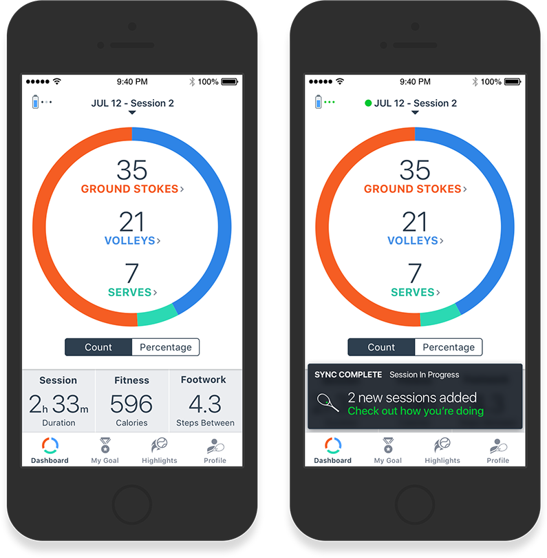
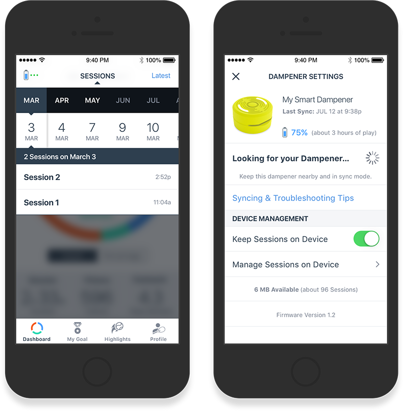
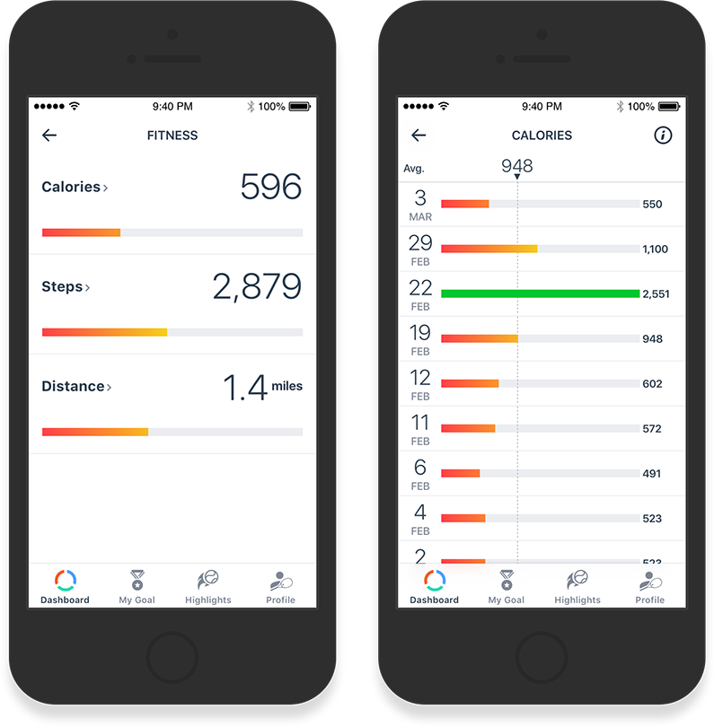
The Dashboard
The Dashboard is the MVP experience for a sports feedback product. We focused on nailing this section so that the product would be shippable even if the rest of the experience was still in flight.
I emphasized clarity and meaning for each of the stats. Performance is color coded, so a player can quickly glance at stats between water breaks. Pro Tips, written by professional tennis coaches, are algorithmically suggested based on a player’s performance, so they can mentally “replay the game” and associate the stats with their on-court actions.
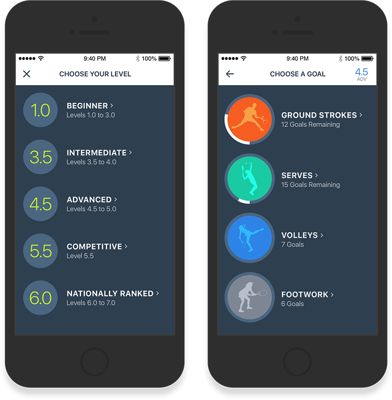
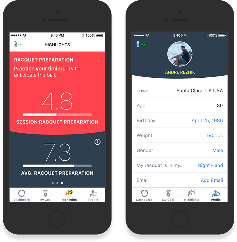
Goals, Highlights & Profile
Goals and Highlights will be the cornerstone of the experience. Goals allow the players to work on one facet of their game at a time, which provides mental focus on the court. I designed the Highlights feature to algorithmically surface additional facets of their game that they are either consistently improving at, or where there is a skills gap.
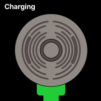

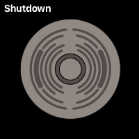
Lighting Design
A device without a screen needs to provide clear indications that it’s function as the user expects. I designed several lighting patterns to provide feedback throughout the usage cycles.
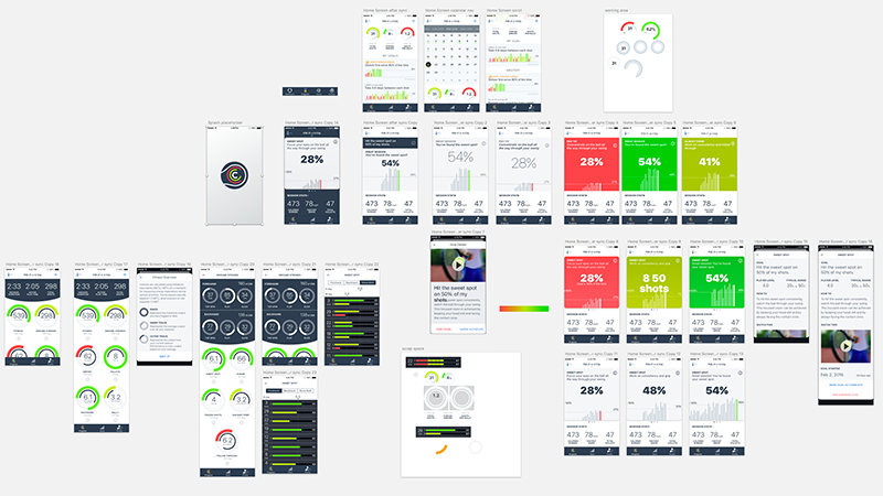
Design Exploration
Many different options were explored for the UI. Most never made it out of Sketch.
As I tested and refined prototypes, the simpler visualizations always resonated more with players. With each pass I asked, “What is the minimal information we could present to the user that would provide the most meaning?”
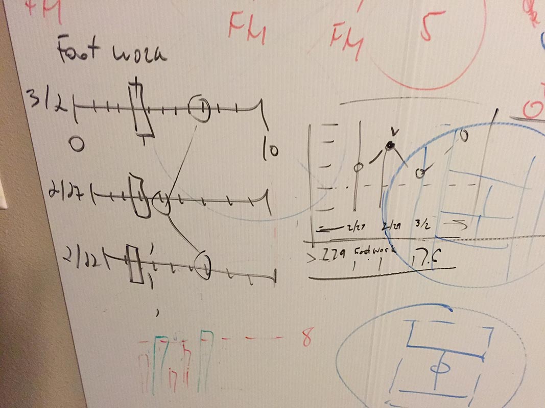
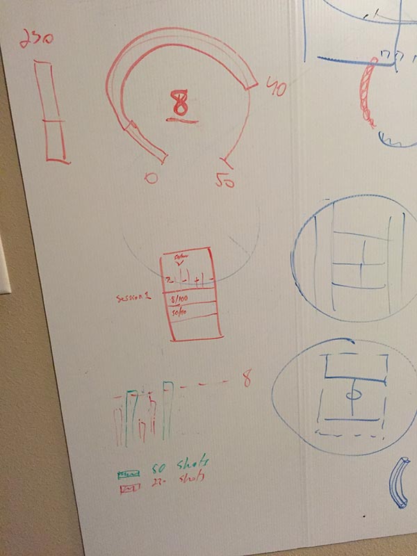
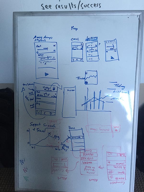
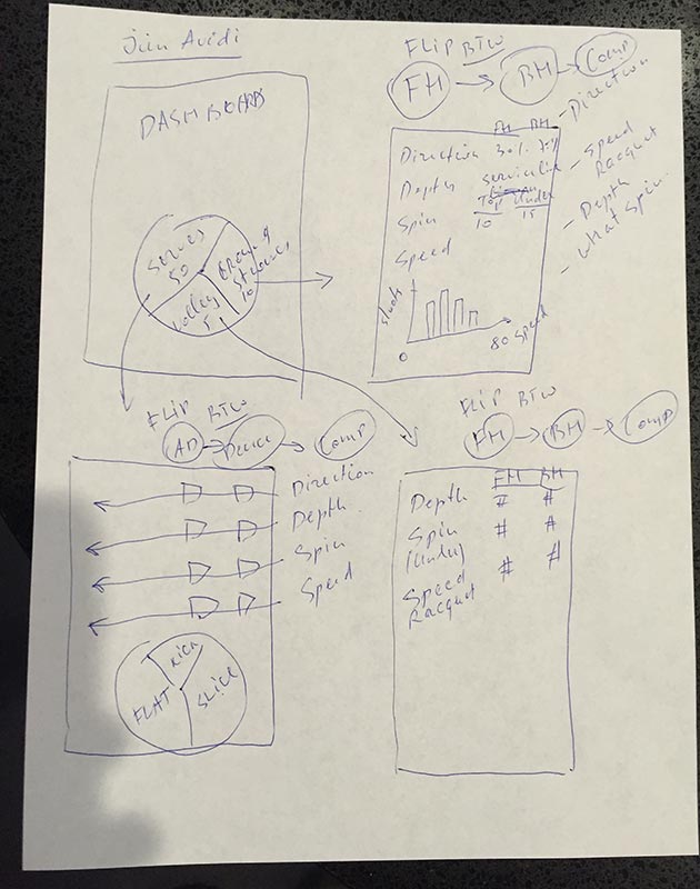
Design Starts on the Whiteboard
Early in the design process we focused on finding the right kinds of visualization tools to help players understand the stats. We explored several different options — many of which didn’t leave the whiteboard. I mocked up several approaches, and we ran them by players and coaches before settling on final visualizations.
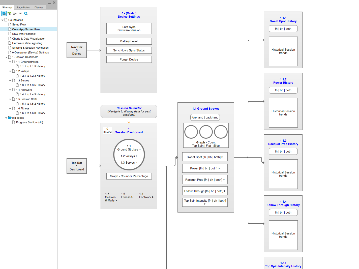
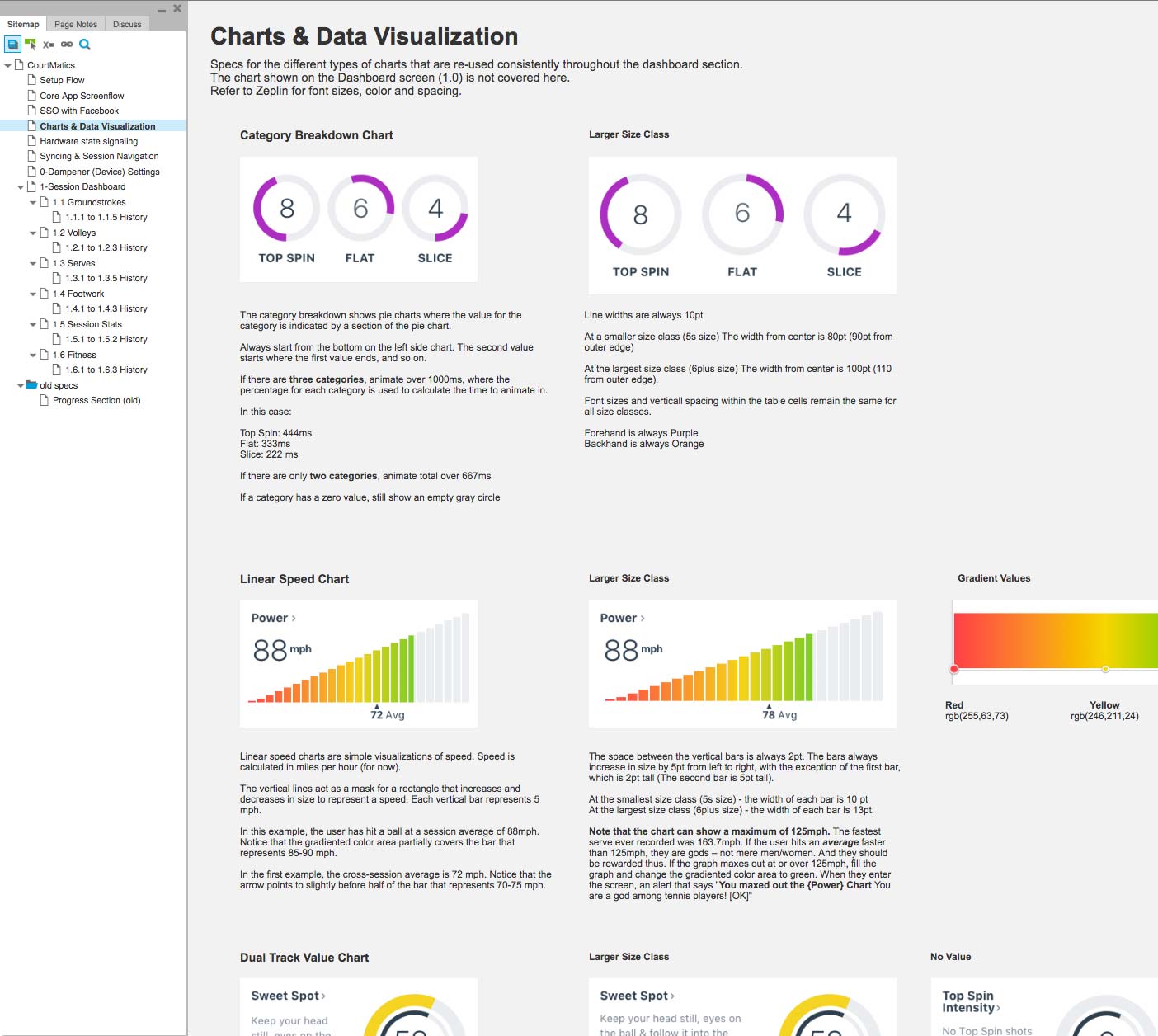
Every Detail is Documented
As with mPath, I write detailed, visual engineering specifications for all features in the product. The software engineering team is in Ukraine, so it’s important to describe the interactions in a way that reduces back-and-forth.
I also deliver assets by building Asset Catalogs in Xcode and committing with Git. I’m using Zeplin to deliver visual design specs.
Aaron has been an invaluable member of our team. He is very diligent in every aspect of his work, starting from the exploratory stage all the way through product design and strategy.
Aaron has a very keen eye for details and an innate ability to learn the nuances that may not seem like a big deal at first, but end up making a very profound impact later on. He also has very clear vision and helped us a lot in discussions that started as ambiguous and ended up with clear direction and focus. His contribution has been above and beyond my expectations.
Andre Reznik, CEO & Co-Founder of Courtmatics