Umbra
- Company
- Rauxa (formerly ThoughtMatrix)
- Year
- 2011
- Responsibilities
- Design Lead, UX, Visual, Product Definition, Client Relationship
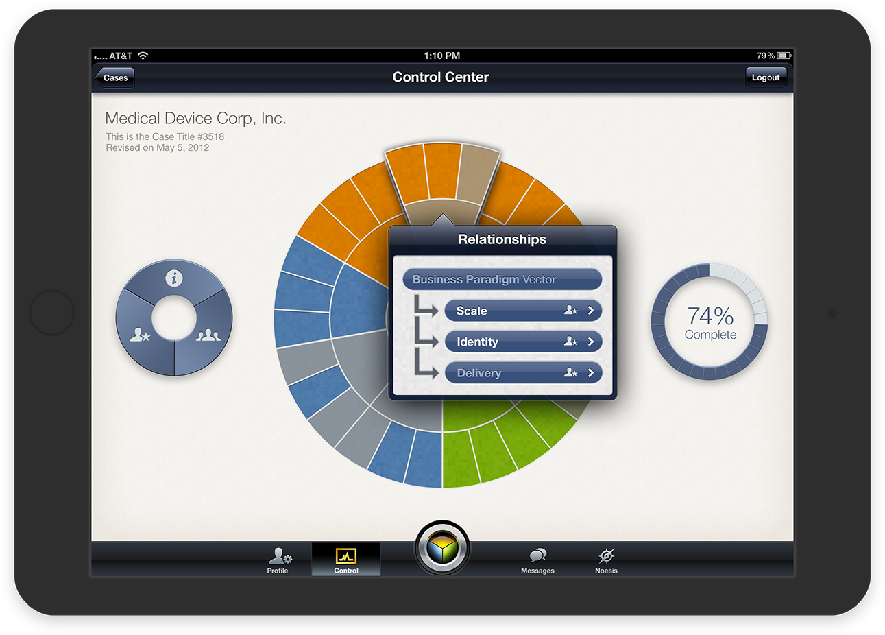
The PROValue iPad app is designed to support a consulting group that provides guidance to the board of directors of publicly traded small-cap companies. The purpose of the app is to provide a unique and enjoyable experience for the participants as they evaluate quantitative and qualitative details about the company.
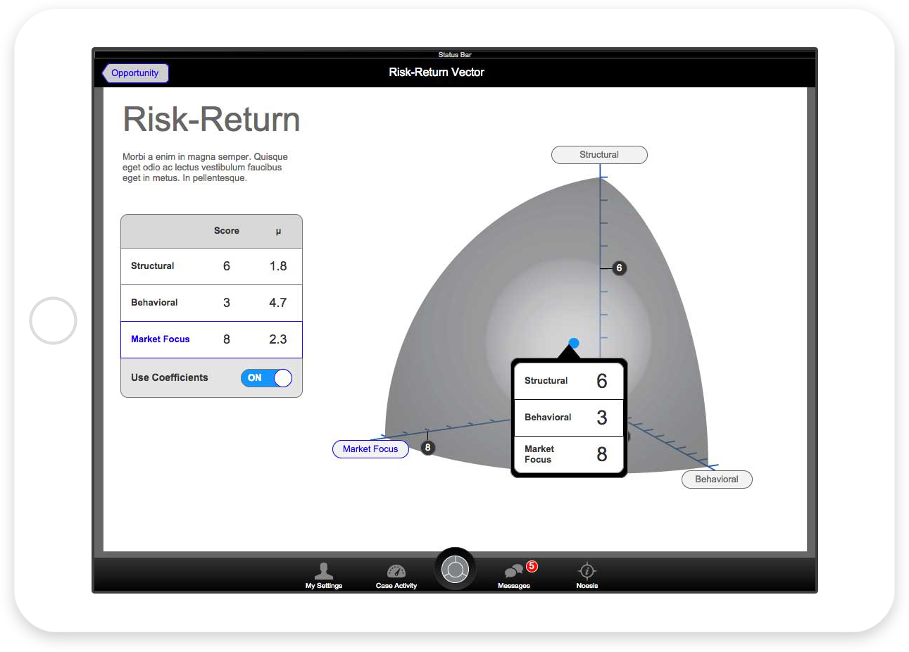
The results are ranked up a stack of three dimensional charts to finally provide a comprehensive PROValuation score — a metric that allows the Board to evaluate areas of the company which need additional attention.
Note: Proprietary information has been removed from the mockups.
Visuals
My client envisioned a highly-customized app experience that appears to be “like working with a precision tool.” The detailed, skeuomorphic appearance evolved from this desire.
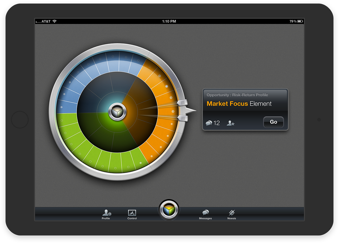
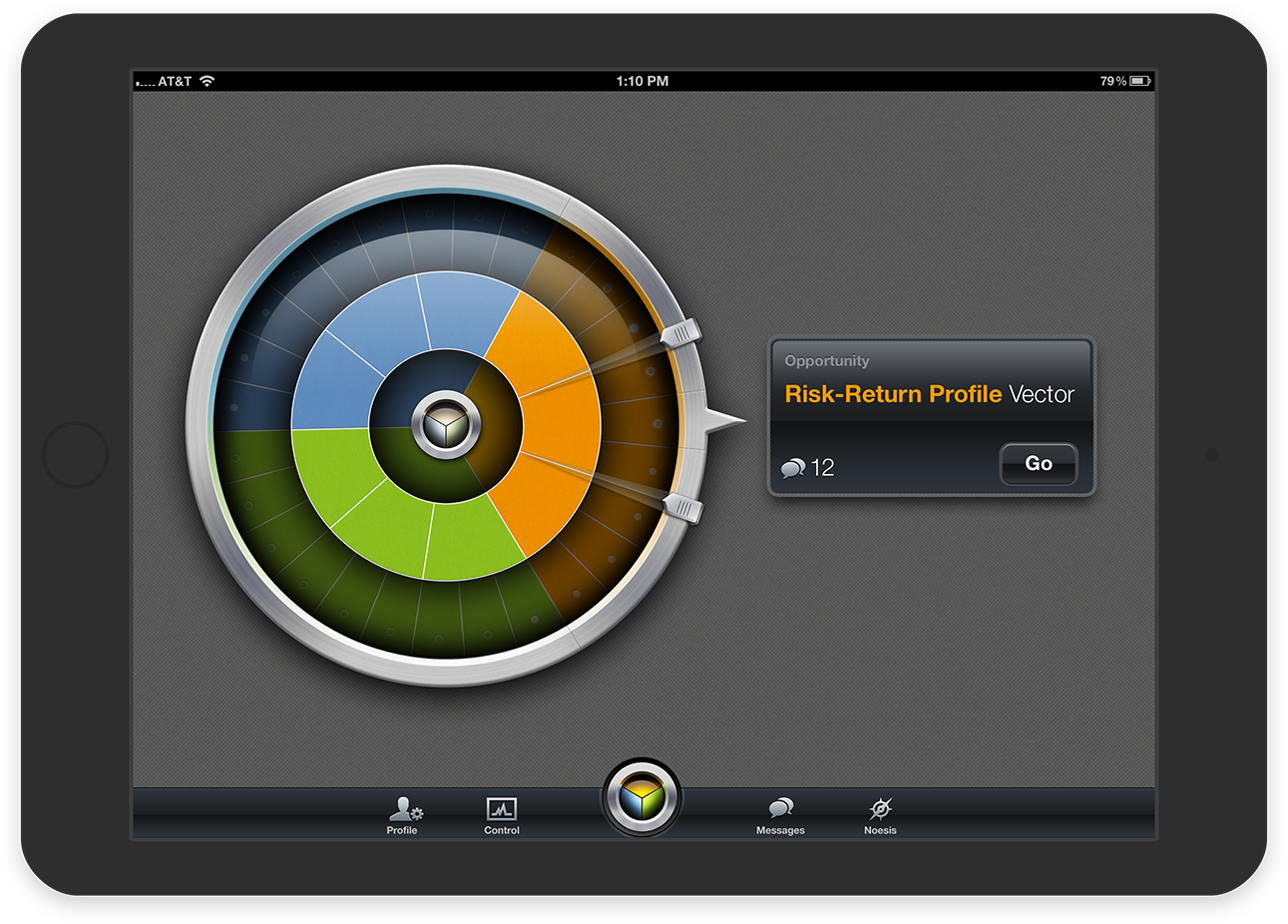
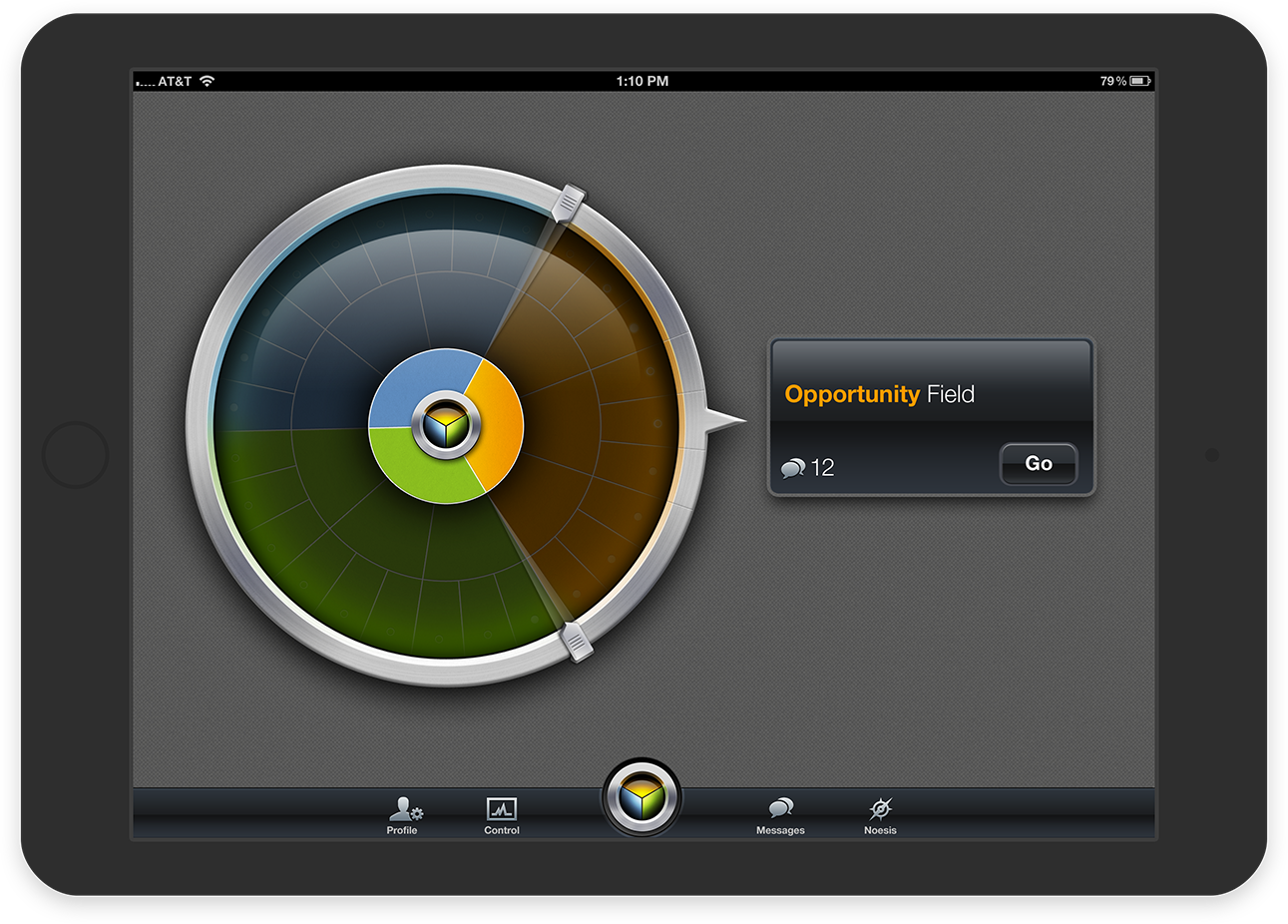
Unique Navigation
The app featured a unique method of transitioning between section. Since the first-level “Elements” sections in the hierarchy had to be completed first, a wheel was presented to navigate between them. Once the screens were completed, the next two levels could be accessed using “calipers” to switch between the levels.
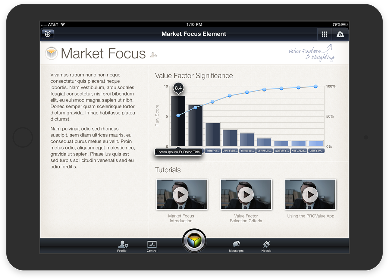
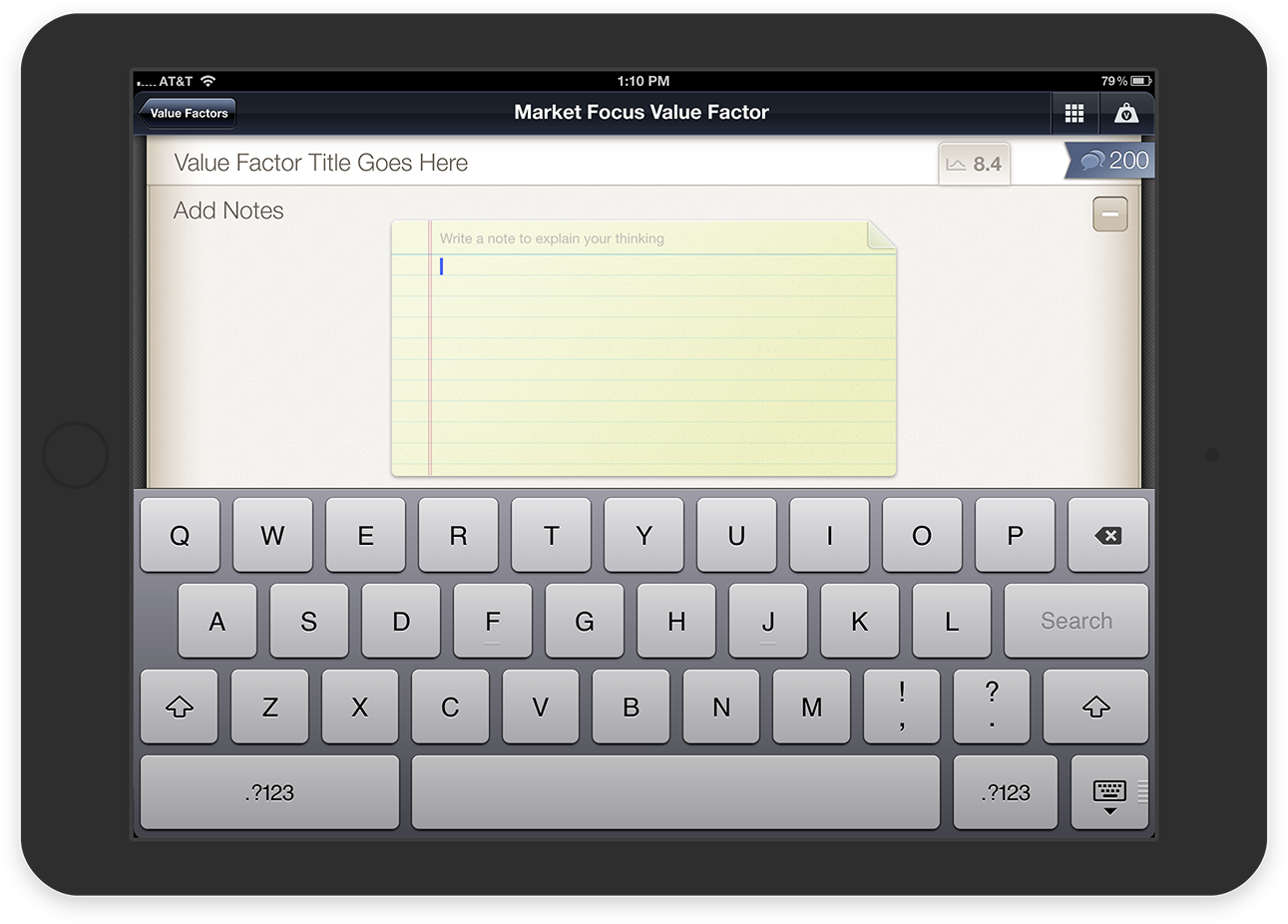
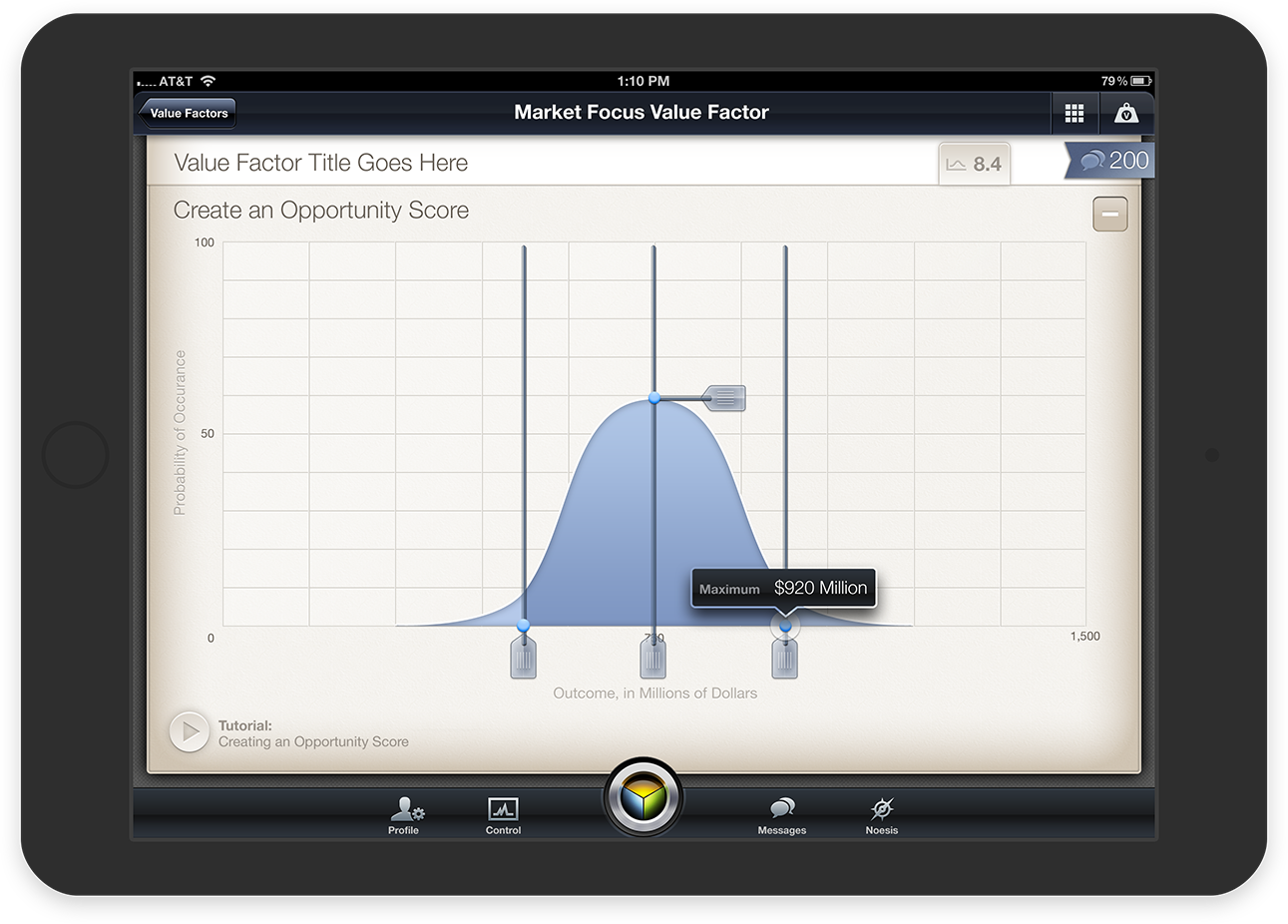
Where the Work Gets Done
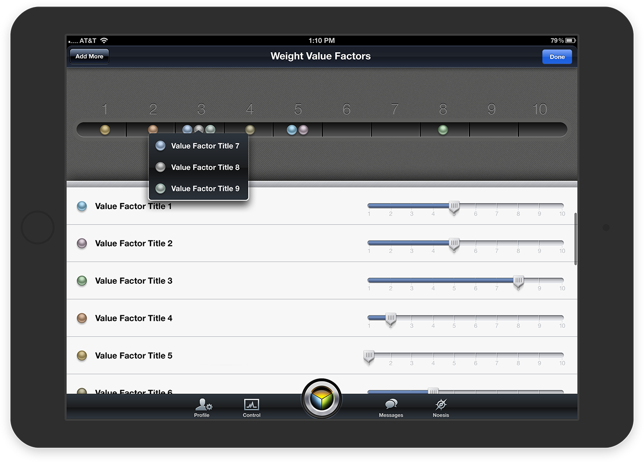
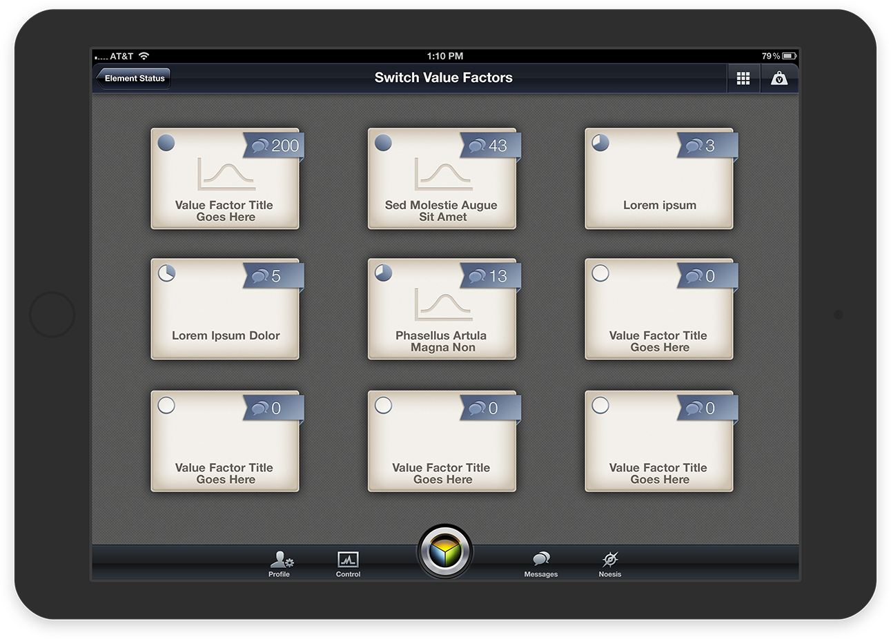
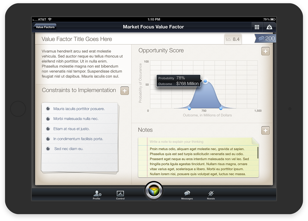
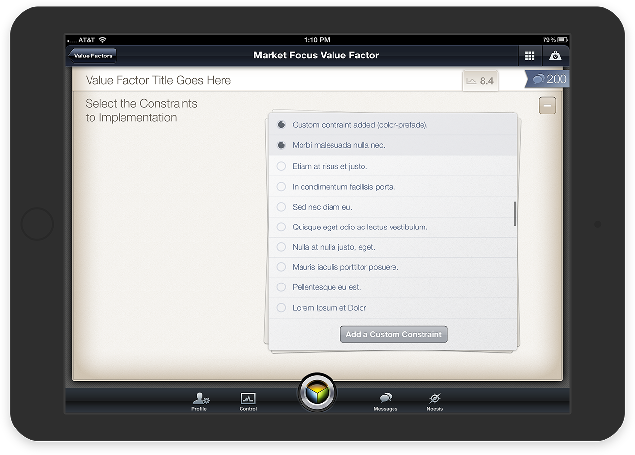
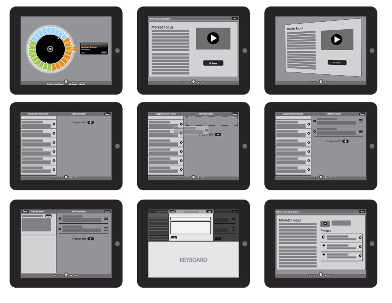
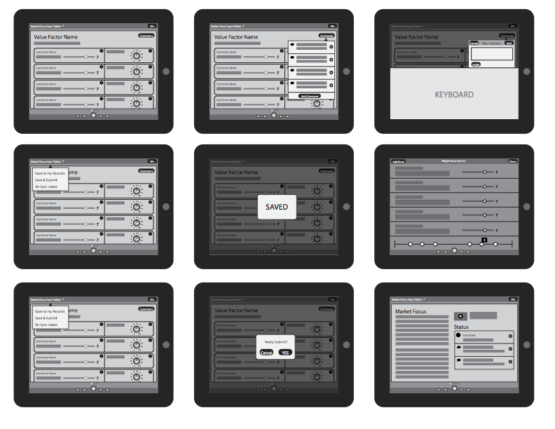
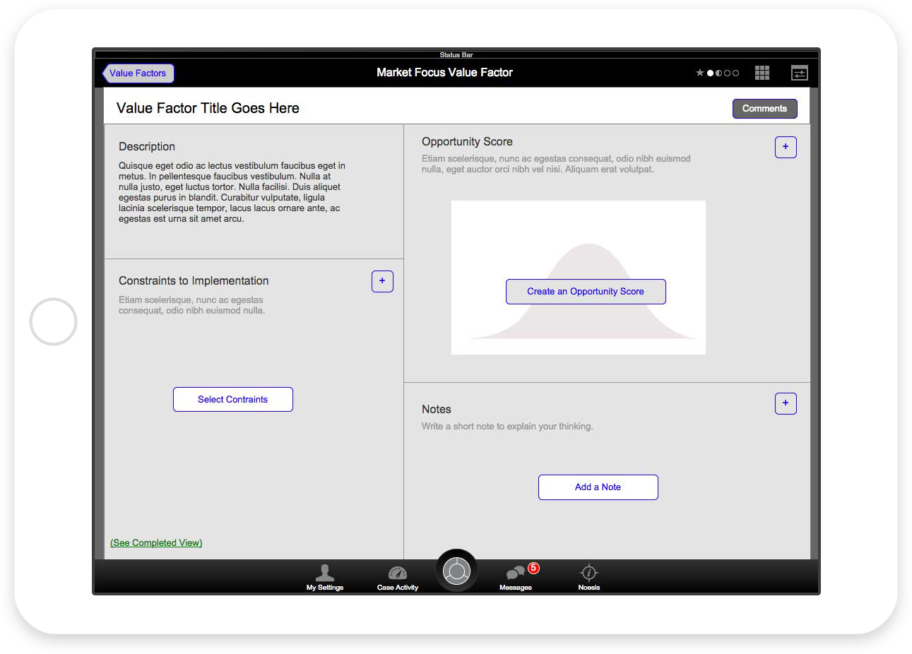
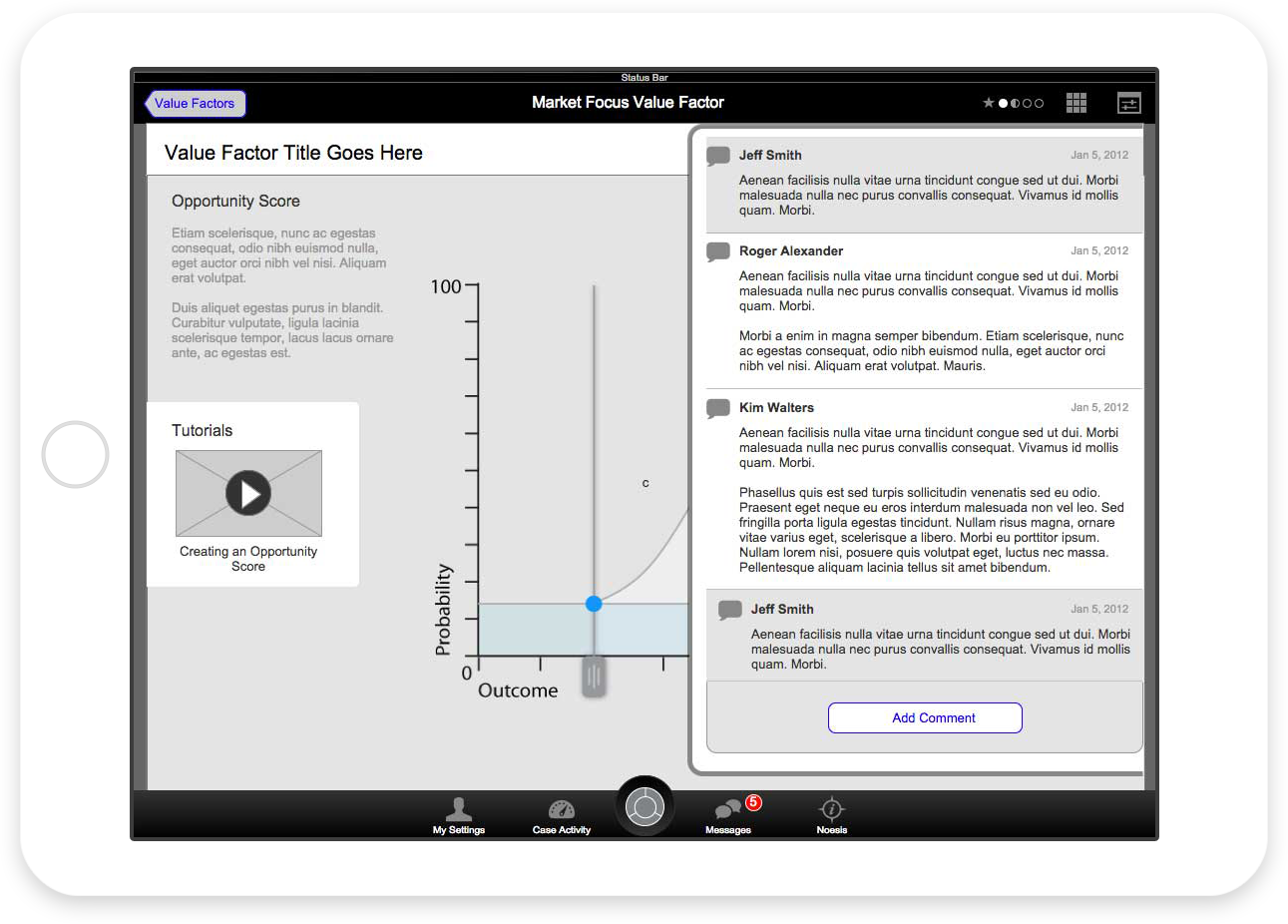
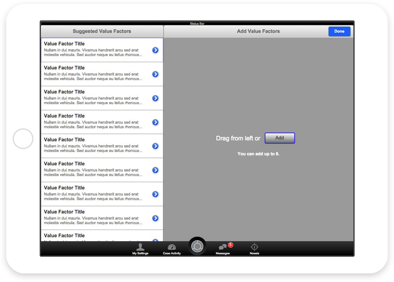
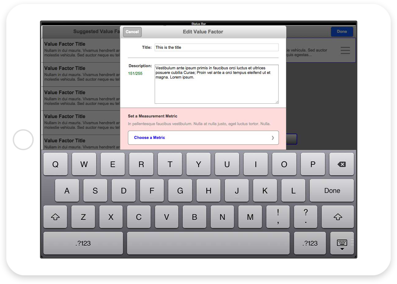
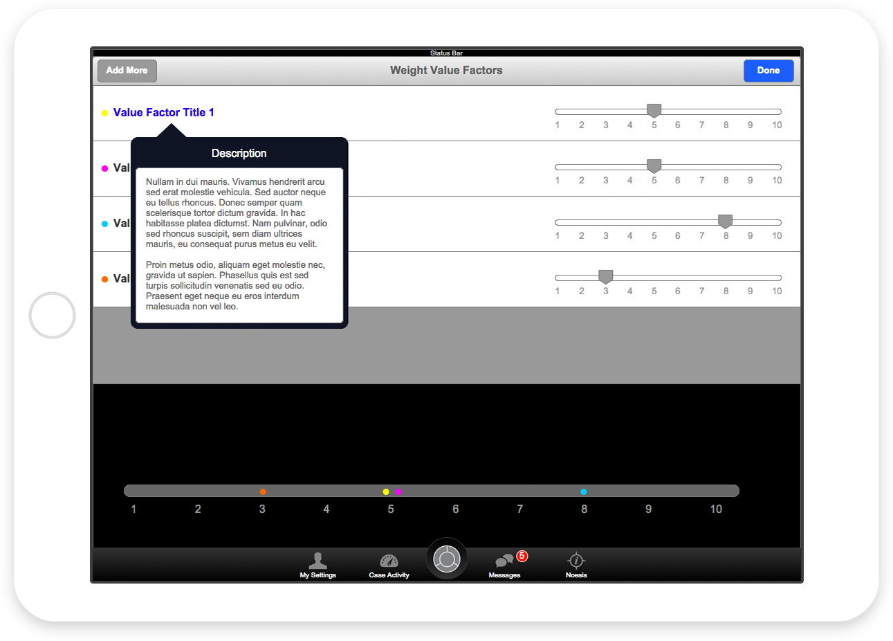
Elements are where the work gets done. Each Element is composed of up to nine “Value Factors,” and each Value Factor has three modules that need to be completed. The interface is designed to allow quick switching between Value Factors and easy access to their weighting attributes.
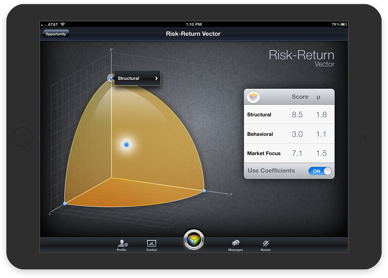
The Results are In
The scores are compiled into a series of three dimensional charts using a proprietary algorithm. The charts indicate the relative strengths and weaknesses of the company, and they allow the Board to determine areas of focus that would improve stock price performance.
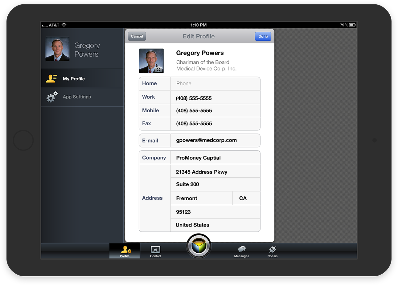
The team can communicate within the app via commenting and profiles. A “Control Center” dashboard provides a central point where team members can track progress.
Process
The app took a little over a year of part-time work to design and build. I worked closely with the client, product manager, mathematician and the engineering team to define and design the product. I brought in other designers, as needed, for feedback and for graphics production.
Most of the product definition was completed during whiteboarding sessions which covered feature definition, specific features details or other aspects of the application. I would take the findings from the whiteboard exercises and build a prototype for the feature. Prior to visual design, the entire app had been prototyped and ad-hoc user tested.
Since so much of the app was defined in detail, visual design went relatively quickly – despite the complexity of the visual style. Once a visual style was defined, I would iterate on a UI with the client and provide mockups and assets directly to the engineering team. We continued to work in this iterative nature until the app was completed.
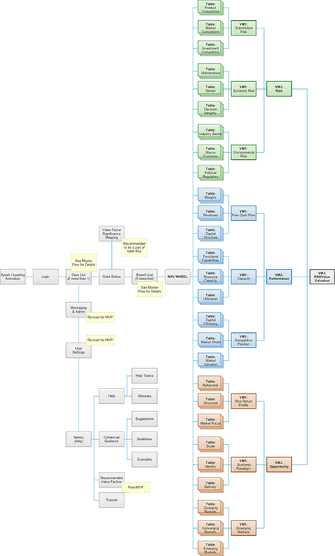
The Navigation Stack
With such a large app, a primary priority was to define an easy and delightful means of traversing the stack. After several iterations, I arrived on the unique circular navigation stack.
Sketching the Flows
After our whiteboarding sessions, I iterated over UI and flow ideas. In order to formalize the process for client review, I ended up creating block-style wireframes in Illustrator, which provided the right balance between clarity and execution speed.
Prototyping the App
In client-agency scenarios, it’s handy to completely prototype a flow before committing to visual design and development. By building “tappable” prototypes in Axure, we could quickly test aspects of the app and make revisions before committing to functionality.
Aaron, I was just reviewing everything and I wanted to let you know how GREAT the whole thing looks! I want you to know personally how much I appreciate you efforts! Your work is impeccable.
Kim Walters, CEO of Umbra (via Text Message)