Wallet Studio
- Company
- Urban Airship
- Year
- 2013
- Responsibilities
- UX Design, Product, Customer Discovery, HTML/CSS, some Marketing
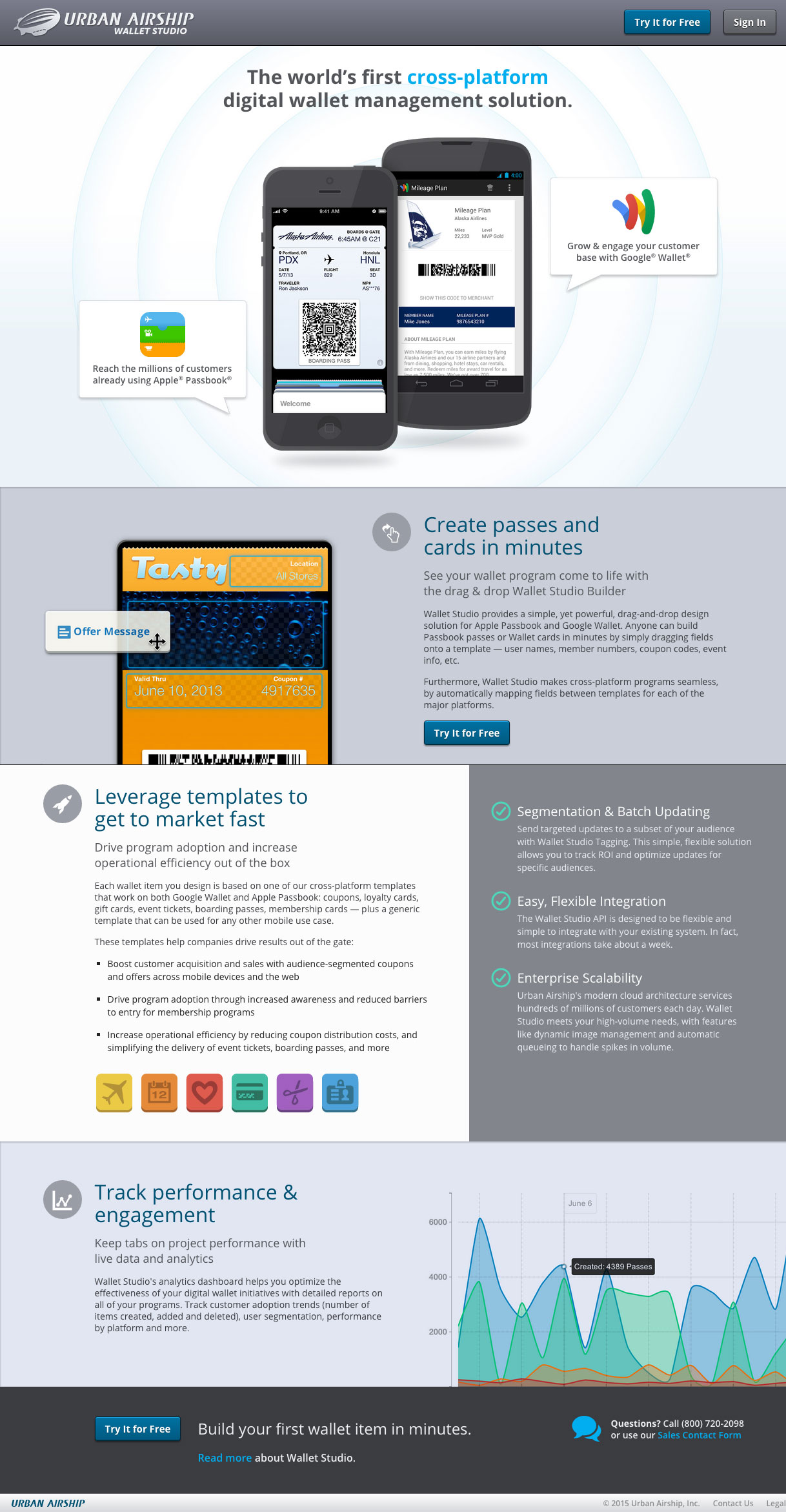
Urban Airship Wallet Studio is a major upgrade of the recently-acquired PassTools. When we relaunched, it was the first cross-platform toolset for delivering both Apple Passbook passes and Google Wallet objects at enterprise scale.
Wallet Studio was completely redesigned, rebuilt and publicly launched in just three months.
When Google Calls…
A few months before Google I/O 2013, Google’s Wallet division approached Urban Airship’s newly-formed Digital Wallet group about collaborating on a secret project that was to be a major focus at I/O.
We were told that we had about a two months to build something, that we had to bring our own customers, and that Google’s Wallet product was still in development.
Of course, we said yes.
The project was akin to designing and building an airplane as you’re loading passengers while it’s rolling down the runway. Since Google was in progress on their product, key details were missing about the visual layout and distribution of Google Wallet objects — with which I needed to design an accurate Card previewer and product flow. I had to make several assumptions upfront, then make substantial changes as the product was being built.
Working fast with a large set of unknowns requires you to carefully evaluate your design decisions — and how they will impact both the end users and the engineering team. I focused on only the important features that would provide substantial value to our customers. We worked with Alaska Airlines as a launch partner, and evaluated features via their experiences with the product.
As more learnings were found, I iterated on the design, and revised the flows. As with PassTools, the engineering team immediately started building from my wireframes while I worked on the visuals and the previewer details. This overlapping approach allowed our team to maximize our limited build time.
In the end, our hard work paid off, and both Google and Alaska Airlines were great launch partners. We were the only integration partner to have customers on our fully functioning product by Google I/O. Google chose to feature Wallet Studio prominently in both their sandbox demo area and the keynote for Google Wallet.
Getting Started
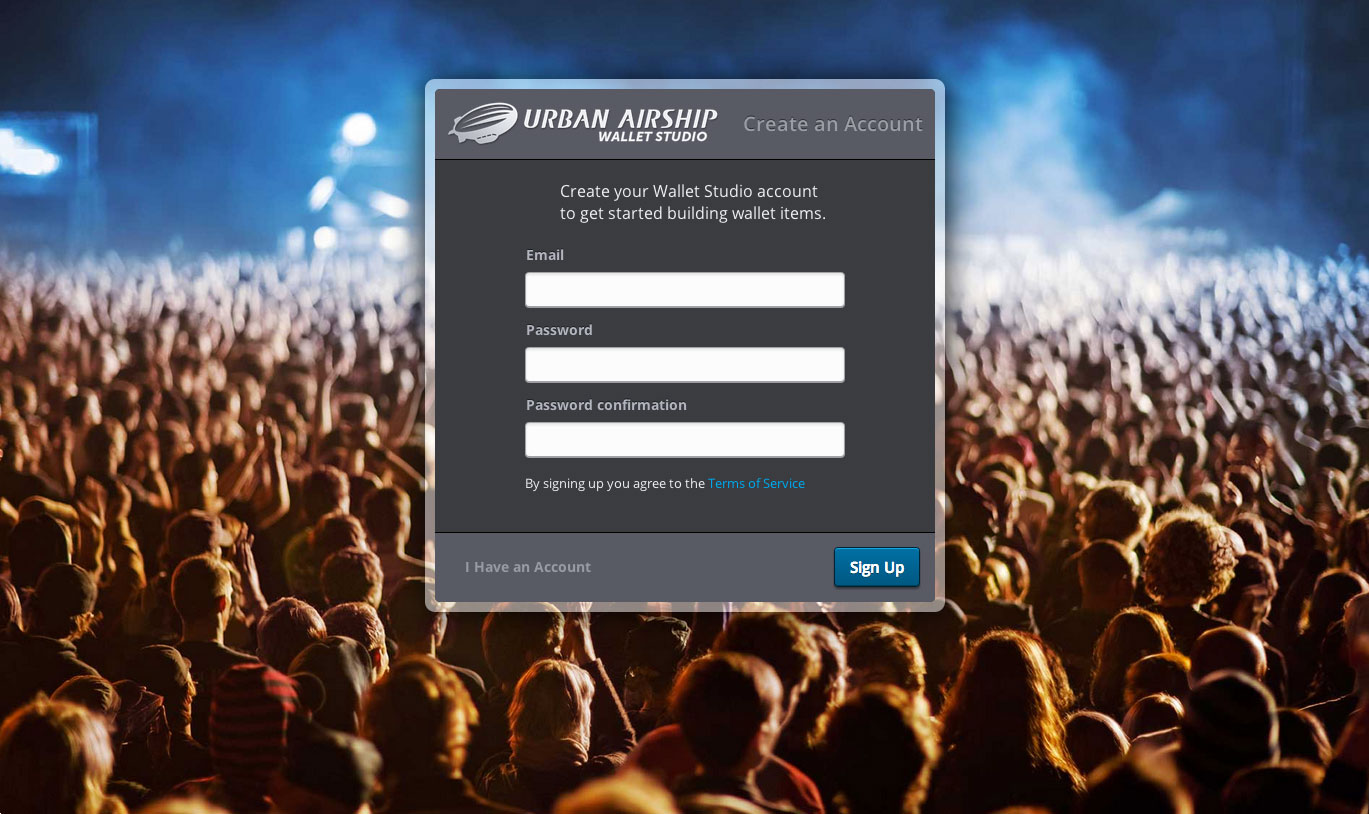
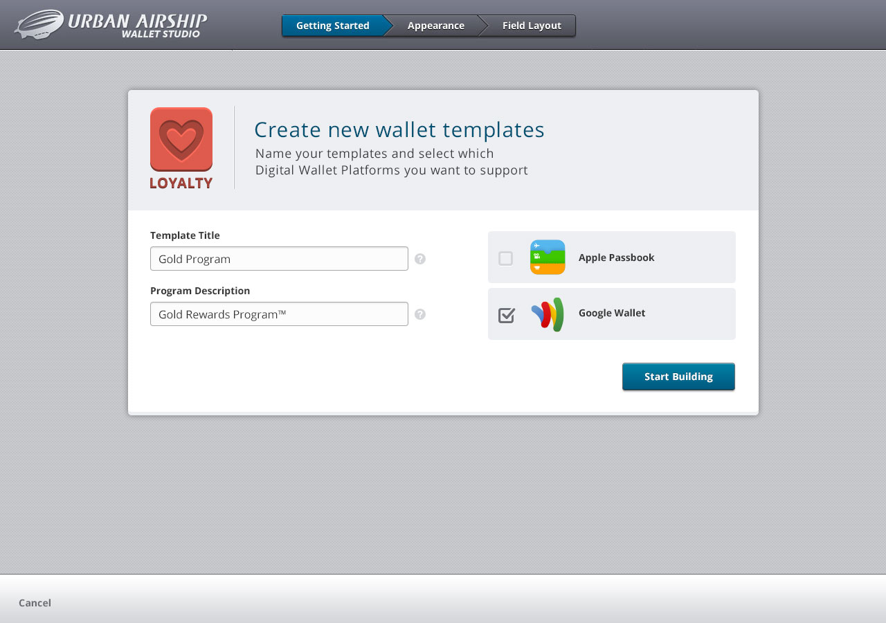
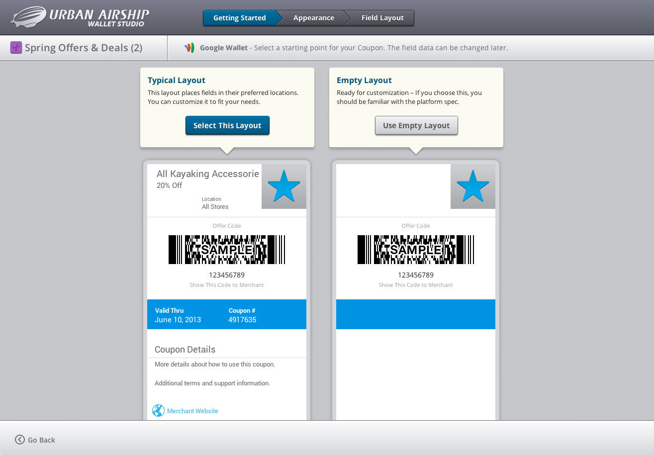
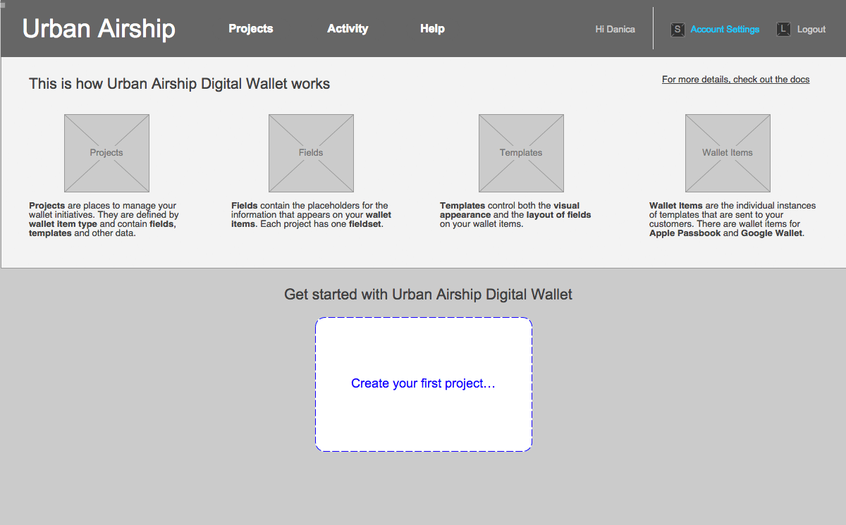
Early customer engagement was important to us. We had found with PassTools that people wanted to spend ample time “kicking the tires” with the template builder. Our new account setup flow allows you to do just that, within 2 clicks. We provided a few sample projects, so users could tinker instead of starting from scratch.
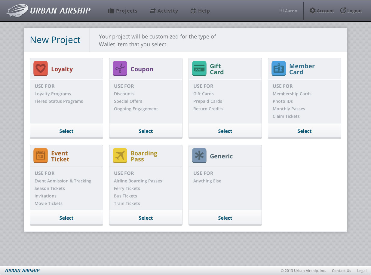
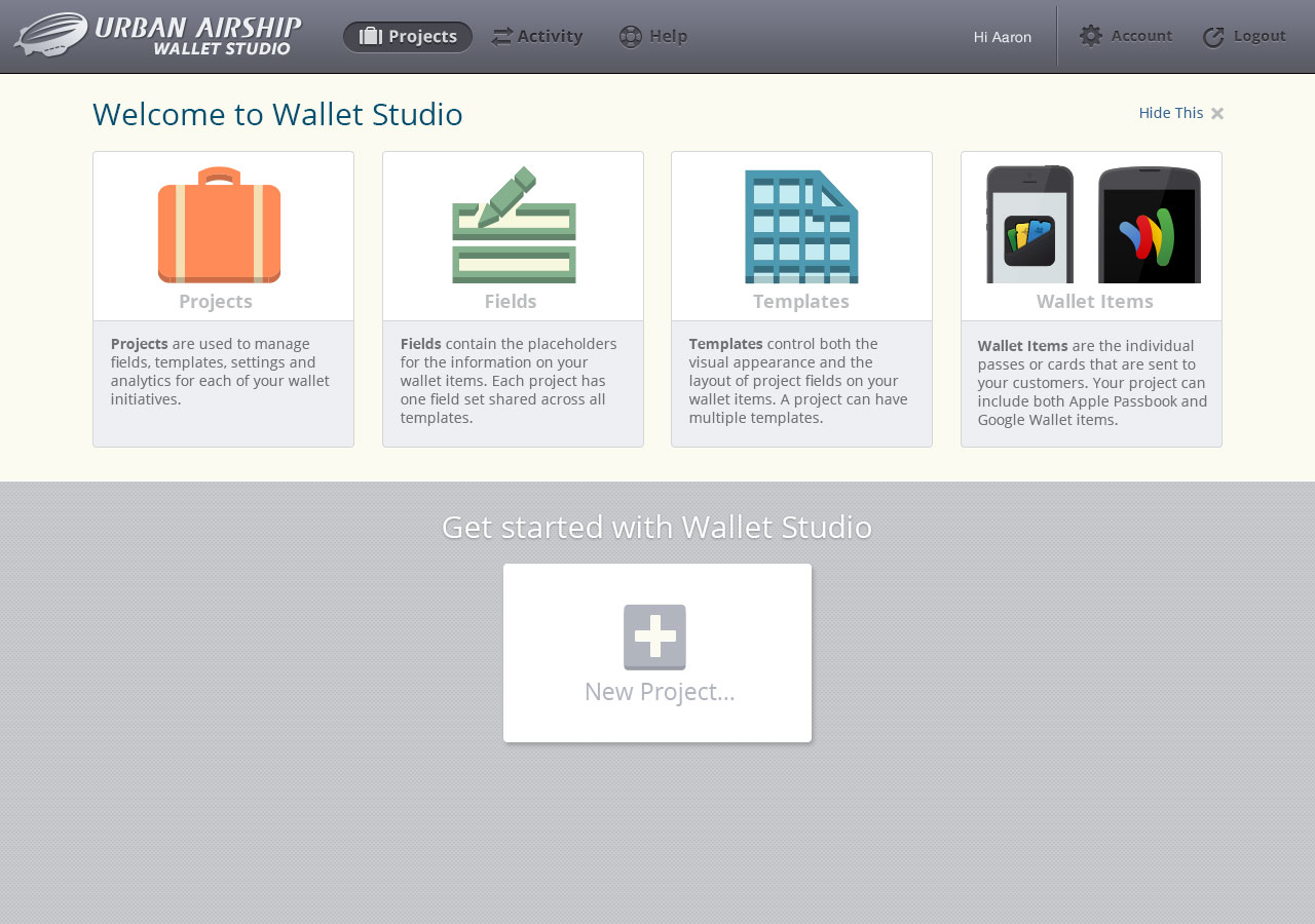
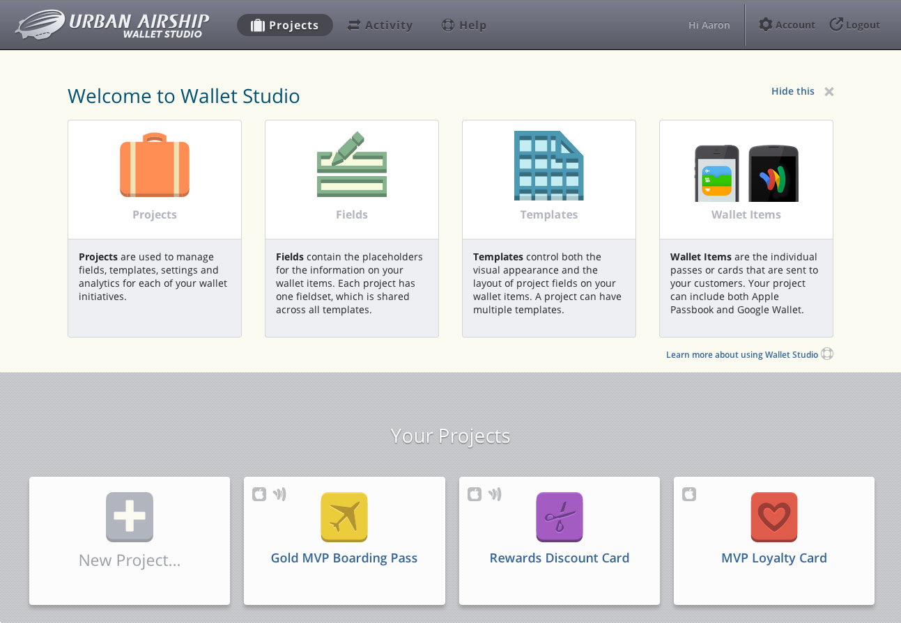
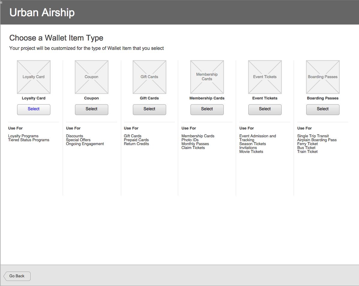
Introducing Projects
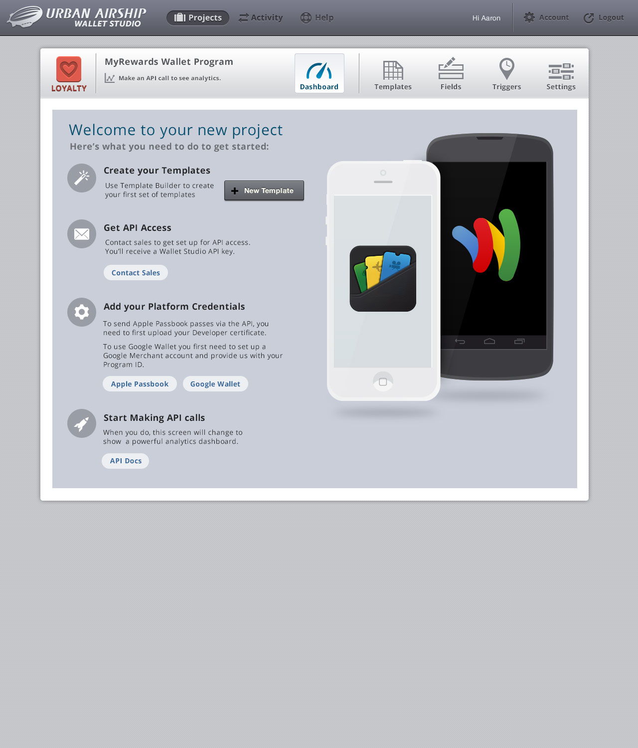
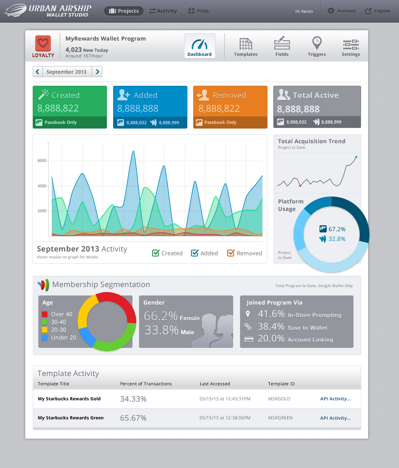
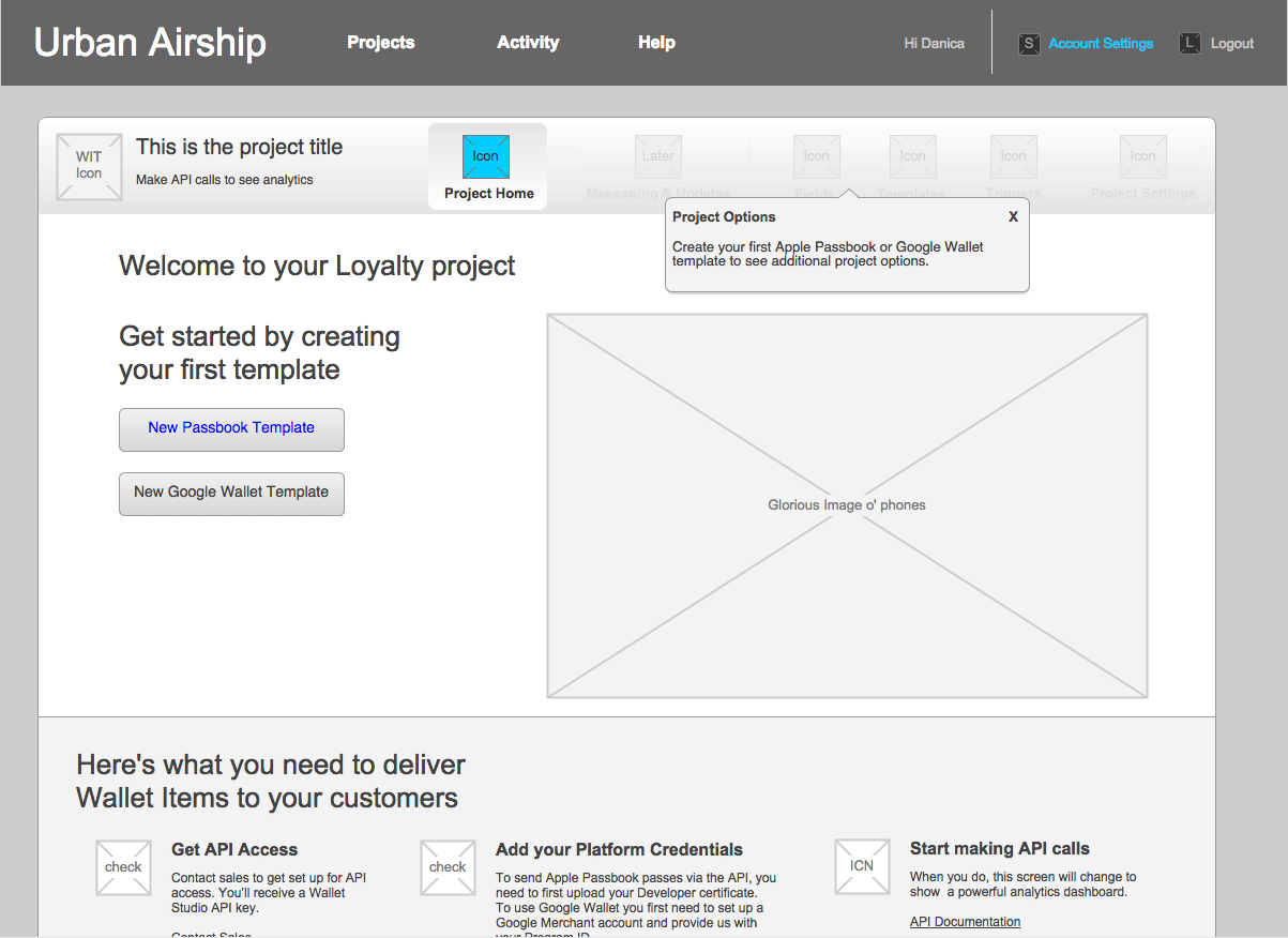
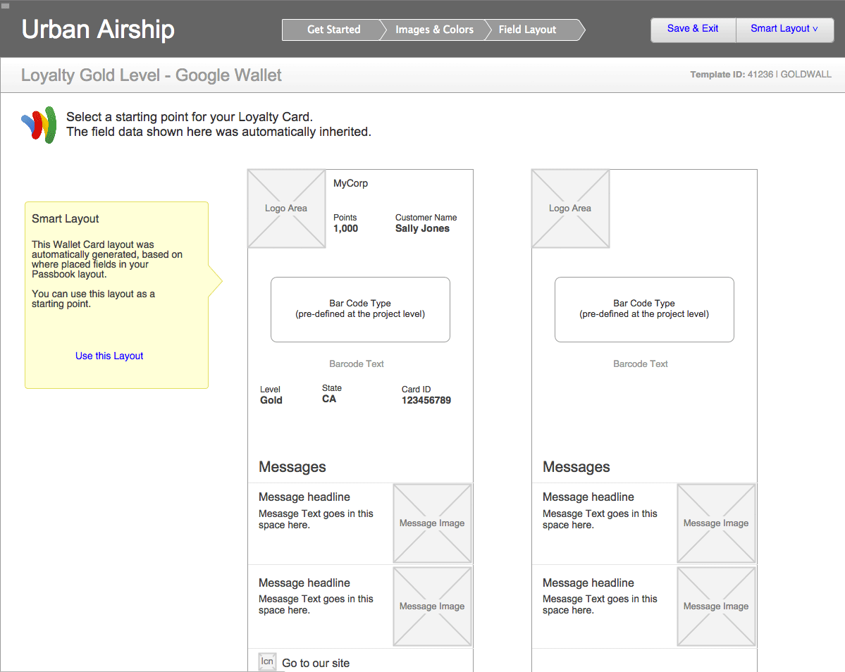
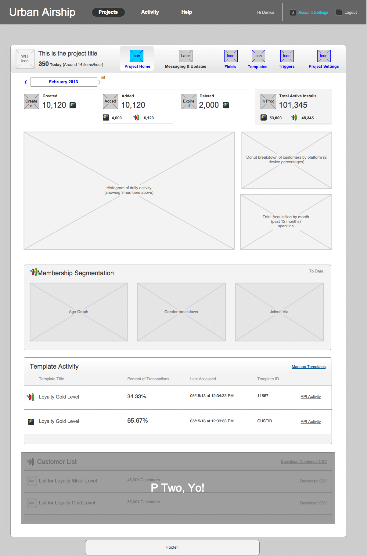
We reorganized the interface using a project/template hierarchy. The addition of projects allowed us to group Google Wallet and Apple Passbook templates together and share fields between the templates. Organizations with users from different departments could control their individual wallet initiatives and ensure that consistent content was delivered to users of either platform. Each project has a separate dashboard, so analytics are easier to examine since they’re separated by content type.
Freedom to Experiment
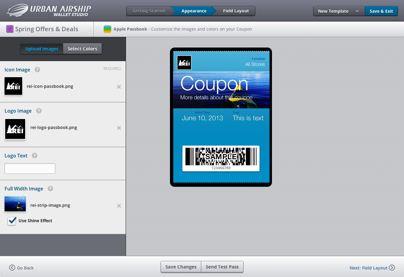
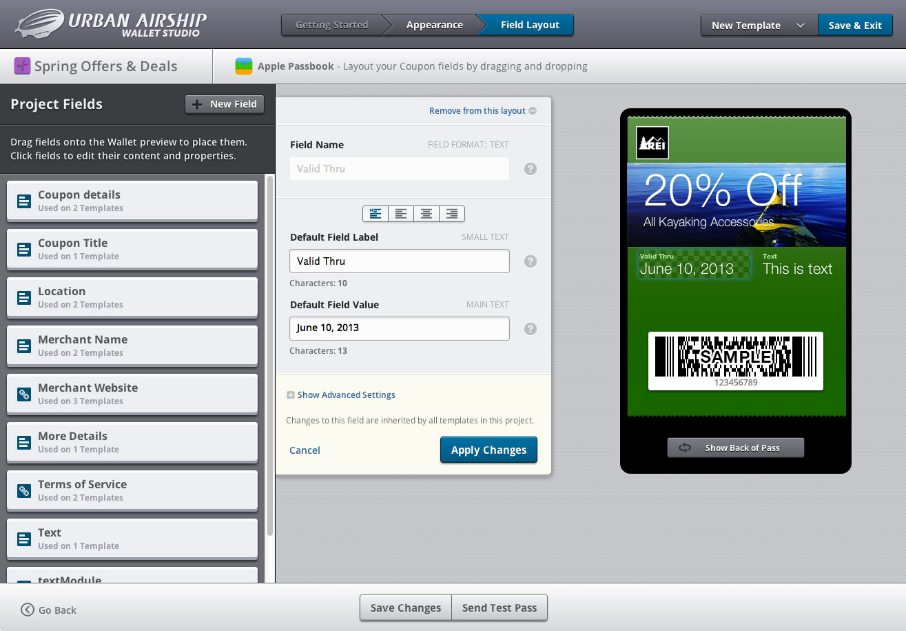
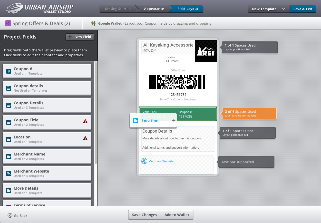
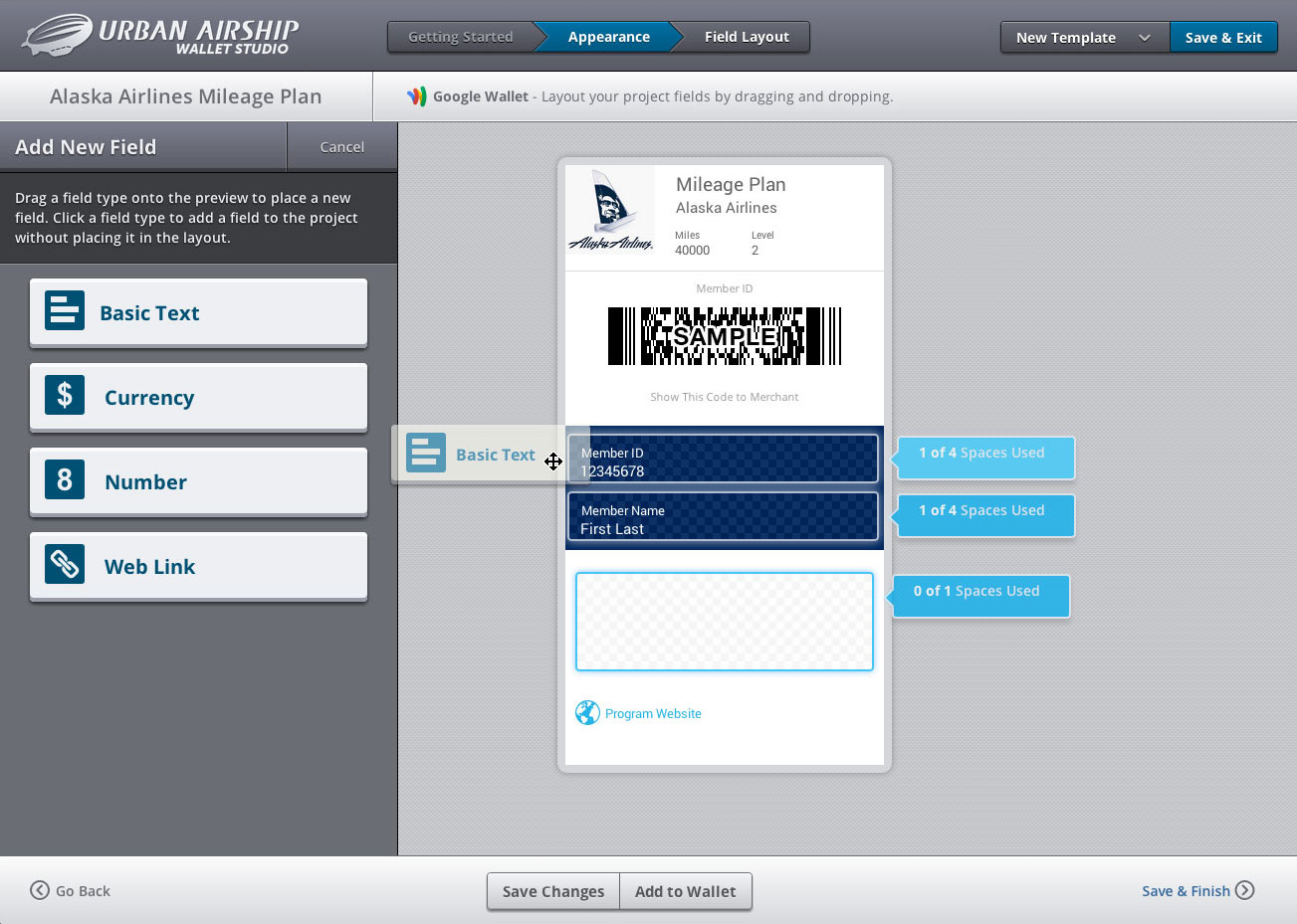
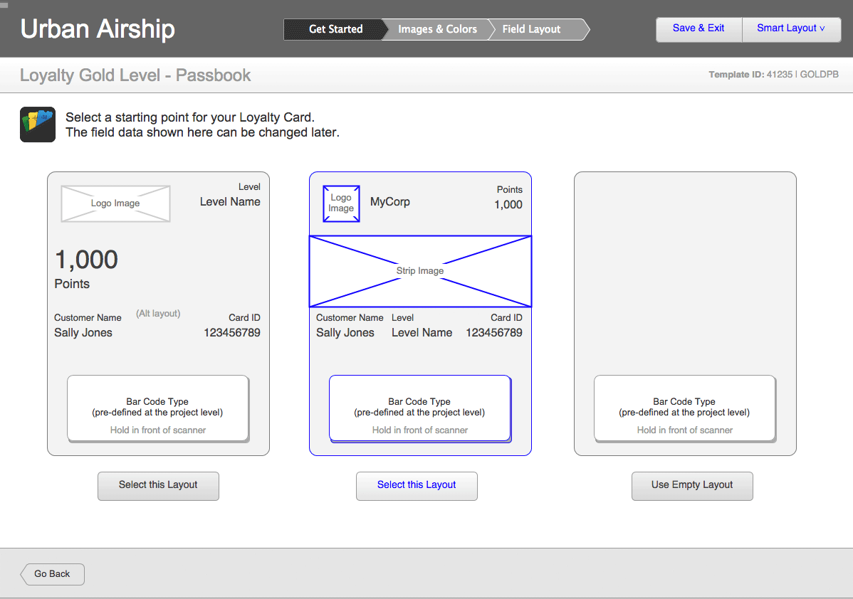
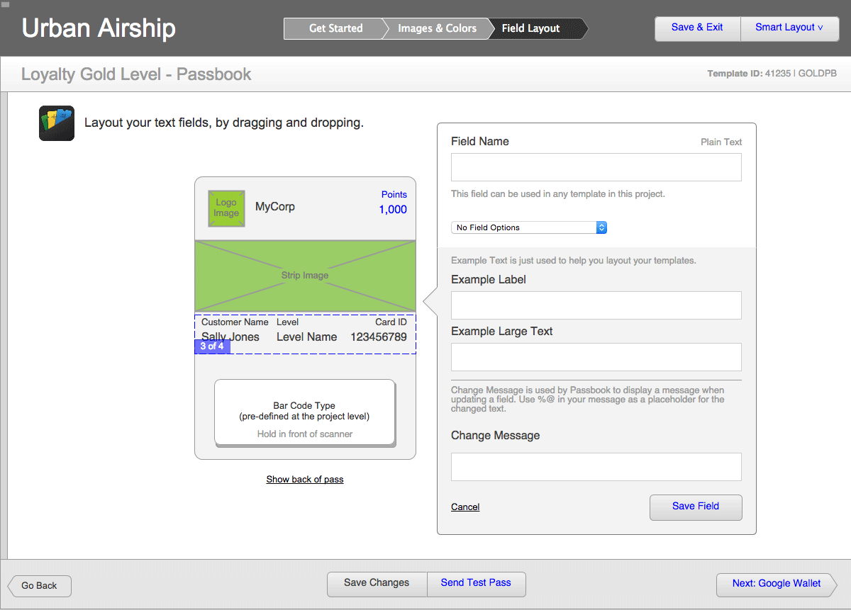
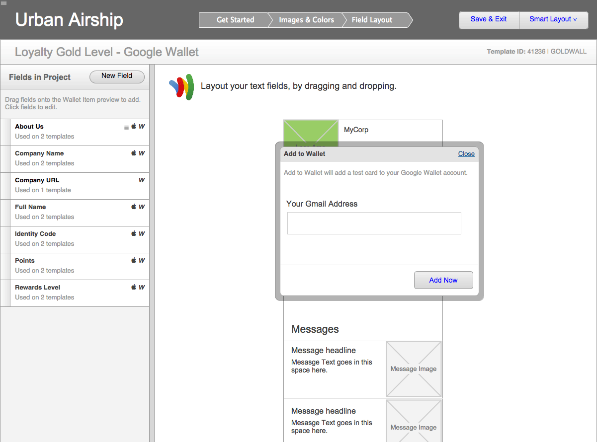
From the beginning, we wanted to introduce an easier means to populate templates. The new drag and drop editor allows users to experiment with content placement on the Card and Pass canvases. The layout system was aware of the Card or Pass spec for of each drop zones. As users started to drag, it shows where they could place content.
Since we were using common fields between the platforms, we also introduced a one-click method to map fields from an existing Card or Pass template to a new one.
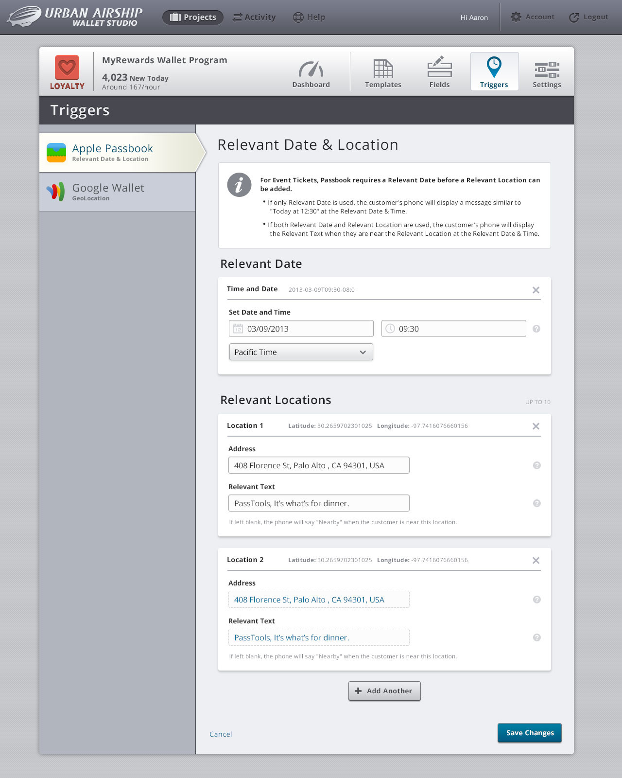
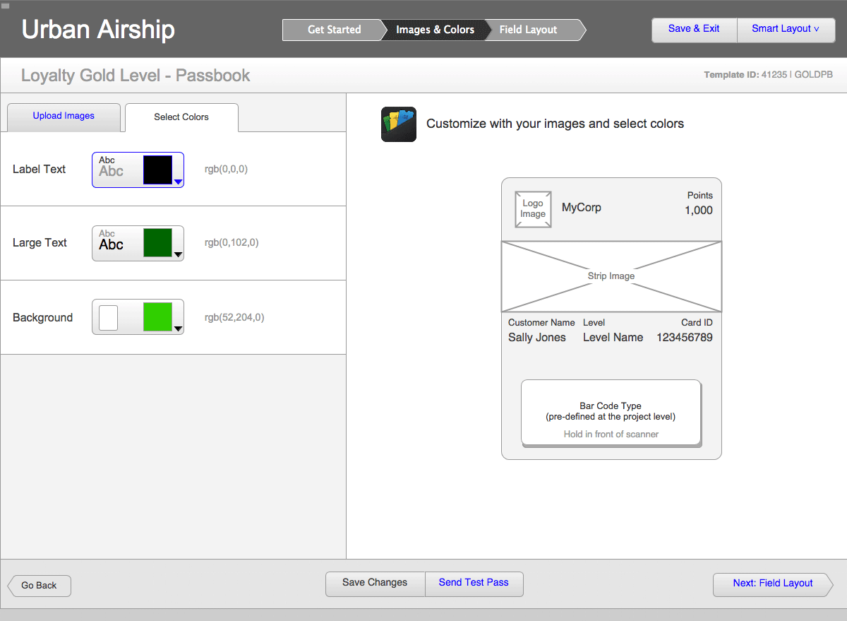
Making Configuration Easier
Each project had several configuration options for each wallet platform that we wanted to surface to the UI. The interface combats the obscurity of some of these options by providing inline documentation via alert areas and field-level help bubbles.
Process
I was pretty excited about the opportunity to completely re-think the product. PassTools, the predecessor to Wallet Studio, had been conceived under an equally aggressive timeline, and there had been limited opportunities to explore different directions.
Over the prior few months, I was already sketching different ideas for a new, completely drag and drop template builder. My goal was that someone who was completely unfamiliar with the Passbook and Google Wallet specs could get the results they wanted without reading additional documentation.
For visual design, we collaborated with the Portland design team to establish a new look for Wallet Studio that utilized Urban Airship’s unique visual language and style guide.
The team started working immediately from the spec that Joe, the Digital Wallet GM, and I wrote. I built a very broad vision via a clickable prototype that showed the basics of the flow. As we received new details from Google about the Wallet platform, I updated the flows and Axure prototype. I switched between wireframing, designing visuals, working with our partners and implementing in code on almost a daily basis.
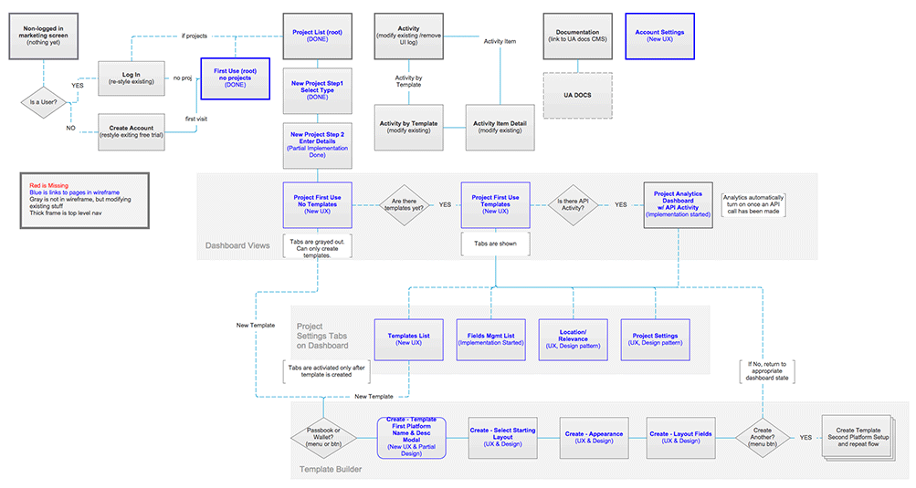
A Visual Map of Project Progress
The flows and screen layouts changed quite a bit as we received new information from Google. To keep everyone on the same page, I built a simplified flow diagram in Axure, and marked sections with different colors if there were changes within the flow. This clickable-map served as a living spec for the entirety of the initial build.
Iterate, Iterate, Iterate…
I designed this clickable prototype in Axure to map out the core flows and interactions. The flows changed quite often, and I would update sections based on new learnings. Near the end of the project, updating wireframes proved to be too time-consuming, since I also needed to help with the app development. When the design overhead became too high, we switched to sketching on whiteboards and designing in code.
Room for Improvement
After we launched, we spent time adding some of the product niceties that we had to punt on in order to launch on time. As with PassTools, I kept a list of UX Grievances — where I noted interactions which were frustrating customers, or areas of the product where a new feature would aid our users. I used this list to help prioritize changes during subsequent sprints.
Products are never finished, and they can always be improved. In addition to talking to our users, I built an ongoing dialog with both the sales and support teams, since they were the front-line to prospects and customers. These conversations yielded several new ideas to improve the product and a series of easy fixes that would greatly improve the sales process or customer experiences.
Aaron is more than a great designer — he cares about the business and how he can contribute beyond design. He’s a tireless advocate for the product user and represents that viewpoint well when working with the engineering team.
Bottom line: Aaron is a great startup guy who I’d want on my team every time.
Joe Beninato, GM of Digital Wallet at Urban Airship / CEO of Tello