Reference
Design system.
Every token and component the site ships, on one page. A private bench for spotting visual discrepancies.
Foundations
Colors
The token law: every color is a CSS variable in colors.css, mapped into a Tailwind utility. No ad-hoc hex. Dark theme only.
Gray ramp
Base
--gray-base · #0a0c0d
bg-base / text-base — page bg
Gray 6
--gray-6 · #181b1d
bg-gray-6 — cards, fields
Gray 5
--gray-5 · #25292c
bg-gray-5 — hover, borders
Gray 4
--gray-4 · #32383b
border-gray-4 — borders, pills
Gray 3
--gray-3 · #41484c
gray-3 — subtle borders
Gray 2
--gray-2 · #555f63
text-gray-2 — muted text
Gray 1
--gray-1 · #778389
text-gray-1 — meta, mono labels
Ink secondary
--gray-text-secondary · #a4adb1
text-ink-secondary — captions, secondary text
Ink
--gray-text · #e8ebec
text-ink / bg-ink — primary text
Semantic
Brand (pink)
--brand-primary · #F316B0
text-brand — eyebrows, focus, maze
Brand alt (orange)
--brand-alt · #FF6E05
text-brand-alt — secondary accent
Link (blue)
--link · #0C8CE9
.text-link — inline links
Flag (yellow)
--flag · #FBC512
text-flag — flags, warnings
Surfaces & states
Nav glass
rgb(8 8 8 / 0.8) + blur(16px)
Selection
Select this text — pink on base.
Focus ring
2px brand · offset 3px
Foundations
Typography
One typeface: Satoshi (variable, weights 300–900). A modular scale on a Minor Third (1.2) ratio throughout, with a fluid body of 17px (mobile) → 18px (desktop): the scale grows off the 17px base on mobile and an 18px base at md/lg. Headings scale fluidly with clamp() — resize the window to watch them move between the two bounds below.
Nominal @theme tokens
| Token | Size | Line-height |
|---|---|---|
| --text-h1 | 3.3125rem / 53px | 1.2 |
| --text-h2 | 2.75rem / 44px | 1.2 |
| --text-h3 | 2.3125rem / 37px | 1.2 |
| --text-h4 | 1.9375rem / 31px | 1.3 |
| --text-h5 | 1.625rem / 26px | 1.3 |
| --text-h6 | 1.375rem / 22px | 1.3 |
| --text-body | 1.0625→1.125rem / 17→18px | 1.5 |
| --text-small | 1.0625rem / 17px | 1.35 |
Note: these named tokens are defined but the shipped headings actually render at the resolved clamp() sizes below.
Shipped heading scale — mobile → desktop
| Element | Mobile · Minor Third | Desktop · Minor Third | Weight | Tracking |
|---|---|---|---|---|
| h1 | 50px | 53px | 800 extrabold | −0.01em |
| h2 | 42px | 44px | 700 bold | −0.005em |
| h3 | 35px | 37px | 300 light | −0.005em |
| h4 | 29px | 31px | 300 light | — |
| h5 | 24px | 26px | 300 light | — |
| h6 | 20px | 22px | 700 bold | — |
| body | 17px | 18px | 400 | — |
Live specimens
Heading 1 — 800 extrabold
Heading 2 — 700 bold
Heading 3 — 300 light
Heading 4 — 300 light
Heading 5 — 300 light
Heading 6 — 700 bold
Body copy at the fluid base size (17px mobile → 18px desktop). Every visible string passes through the typographic modifier — curly quotes, em dashes, and the × sign are upgraded automatically.
Small text — captions and secondary meta at 1.0625rem.
Weight ramp — Satoshi-Variable
300 · Light — the way through keeps shifting
400 · Regular — the way through keeps shifting
500 · Medium — the way through keeps shifting
600 · Semibold — the way through keeps shifting
700 · Bold — the way through keeps shifting
800 · Extrabold — the way through keeps shifting
900 · Black — the way through keeps shifting
Text component classes
.eyebrow — uppercase pink label
An inline .text-link in the body flow — blue with a soft underline.
Foundations
Spacing, radii & states
No custom scale — Tailwind's default rem steps. Layout rhythm is a container of max-w-7xl px-6 lg:px-10 with section padding stepping py-12 → py-16 → py-24.
Spacing scale
Radii
4px
btn / field
0.375rem
inline code
1rem
prose images
rounded-full
pills / tags
Elevation
panel shadow
Layout rhythm
- Container — mx-auto max-w-7xl px-6 lg:px-10
- Section padding — py-12 → py-16 → py-24 (with lg: bumps)
- Sticky offset — top-28 (7rem)
- Anchor offset — scroll-margin-top: 7rem on h2[id]
Foundations
Breakpoints
Only two custom breakpoints on top of the mobile base. The live badge below reports the active range — resize to watch it change.
| Name | Token | Min-width |
|---|---|---|
| base | — | ≈ 320px |
| md | --breakpoint-md | 45rem / 720px |
| lg | --breakpoint-lg | 64rem / 1024px |
Assets
Icons
Inline SVGs from one partial — partials/icons with a name and class. They inherit currentColor.
Primitives
Buttons & form fields
Buttons
Circle buttons
Form fields
Tags & pills
Components
Cards & modules
The one card partial, its entry-mapper wrappers (fed a real entry each), and the standalone modules.
Card variants
Card with thumbnail
Square-cornered surface, flush 4:3 image, padded meta. Title turns brand pink on hover.
Card without a thumbnail
When thumb is omitted the card renders the flush 4:3 placeholder panel instead of an image.
External card with pill
external adds the arrow-up-right glyph and opens in a new tab; meta2_pill renders the category as a bordered pill.
Entry-mapper cards

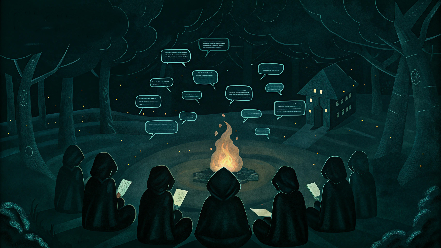
If Every AI Feature has a Text Box, How Do You Get It Right? (part 2)
Once chat is ruled in, the craft is composition, editing, and repair loops, not the chat box. How to build AI conversation surfaces that actually hold together.
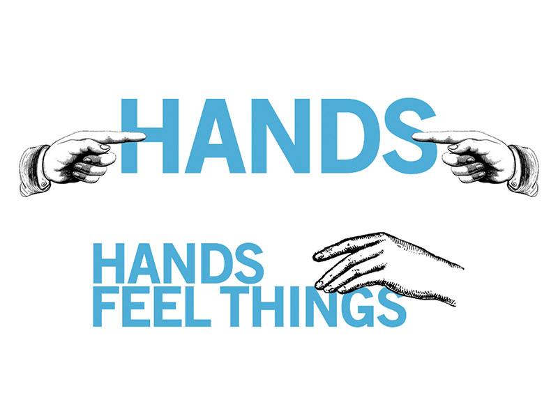
A Brief Rant on the Future of Interaction Design
An exceptionally furious, clarifying argument that our glass rectangles waste the human hand and body. Read it before you call anything intuitive.
Reimagining the Design System for an AI-First Platform
Rebuilding a five-year-old design system around agentic interaction patterns, consolidating a sprawl of confirmation flows into a single trustable model.
Article list-item row
Oct 7, 2026
If Every AI Feature has a Text Box, How Do You Get It Right? (part 2)
Once chat is ruled in, the craft is composition, editing, and repair loops, not the chat box. How to build AI conversation surfaces that actually hold together.
Aug 23, 2026
Every AI Feature Doesn’t Need a Text Box (part 1)
Chat is often the lazy default. Instead, use a pattern selection model that maps task type to the right interaction affordance for AI product design.
Section heading
Eyebrow
With a call to action
Eyebrow
Without a call to action
Page header
The secondary-page title band (this page's own header uses the same partial). It normally carries a compact maze, suppressed here via hide_header_maze.
Eyebrow
Page header module
An intro paragraph sits below the title.
Contact CTA
Components
Page-builder blocks
The seven content_blocks set types, driven by dummy data in this page's front matter. Each is labelled with its type; markup mirrors the blocks/index dispatcher.
text_block
Text block
A narrative section rendered from a markdown field through the prose-article class. Body copy runs at the fluid 17→18px base with a 1.6 line-height, links pick up the blue underline, and vertical rhythm comes from the * + * rule.
A blockquote gets the brand-pink left rule.
Inline code gets a gray-6 chip, and every text node still passes through the typographic modifier.
quote
The care isn’t up for discussion; the tools just let it travel further.
code_block
export function greet(name) {
  return `Hello, ${name}`
}
image_full
image_grid
video_embed
stat_band
By the numbers
- 54
- Resources curated
- 3×
- Faster to ship
- 1
- Loud color
Components
Runtime components
These need a live paginator or a JS-built table of contents. Here they run against real data so they actually render.
Pager
Driven by a real paginated articles query (3/page); links point at /articles.
Scroller nav
The sticky right-column table of contents (visible at lg), built by JS from the h2s in the left column.
First section
The scroller nav below picks up each h2 in this column and builds a live, scroll-spied list.
Second section
Scroll the page and the active item updates via an IntersectionObserver.
Third section
Under reduced motion the transitions are stripped but the nav still works.
Chrome
Header, nav & footer
These render live at the top and bottom of this very page (via the layout), so there's no specimen to duplicate:
- partials/header — sticky logo bar (glass surface)
- partials/main-nav — desktop links + mobile slide-down (menu icon)
- partials/maze-settings — the sliders widget in the header that tunes the maze backdrop
- partials/footer — social links + colophon link (bottom of page)
- .maze-curtain — page-transition curtain mounted once in the layout
Identity
Maze presets
The living maze mounts on any [data-maze] element. It is documented here rather than rendered — this page keeps a plain background so components read clearly. Three presets ship:
- page — full-page fixed backdrop; lively top band, static below.
- compact — denser, calmer; used in the secondary-page header band.
- hero — larger cells, longer runs.
Behaviour
Motion
Interactions are subtle and fast — 150–350ms ease-out, scale ≤ 1.05. Every section on this page uses the .reveal entrance. All of it collapses to instant under prefers-reduced-motion.